


FLYERS


Willow Springs
at Providence
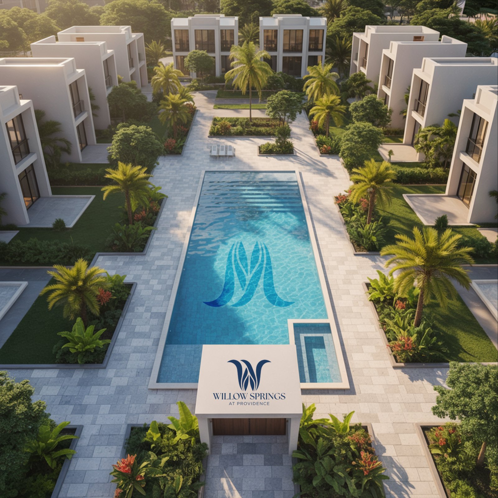
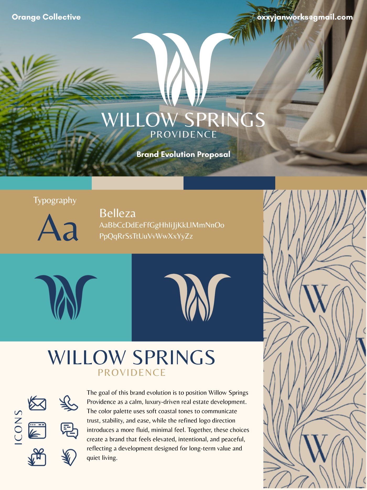
Willow Springs at Providence is a housing development in Guyana preparing a new phase. As a freelance designer, I led a full rebrand, building a new feel rooted in the country’s landscape and in the sense of calm the developers wanted new homeowners to feel the moment they arrived.
“The goal of this brand evolution is to position Willow Springs Providence as a calm, luxury-driven real estate development.”
“The color palette uses soft coastal tones to communicate trust, stability, and ease, while the refined logo direction introduces a more fluid, minimal feel. Together, these choices create a brand that feels elevated, intentional, and peaceful, reflecting a development designed for long-term value and quiet living.”

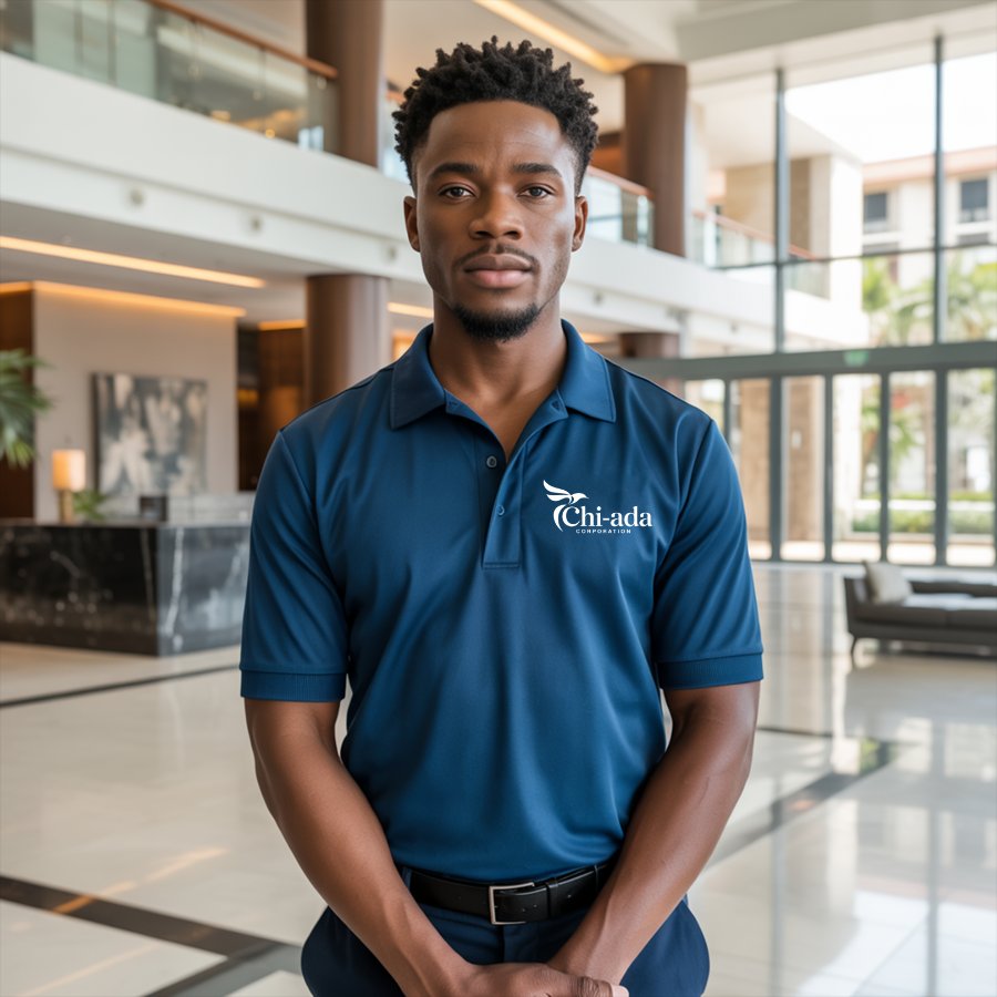
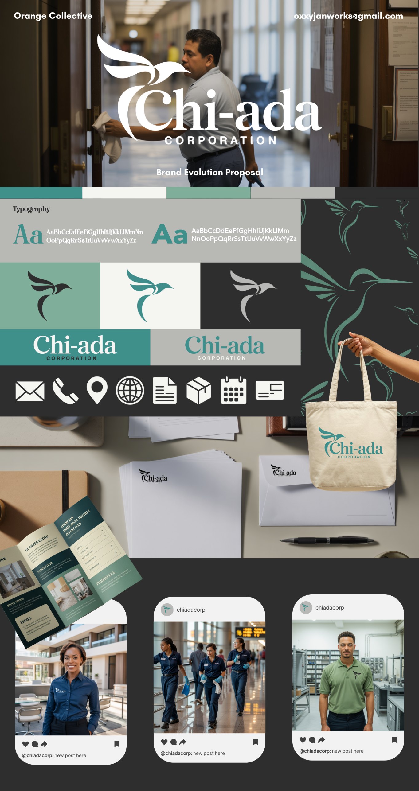
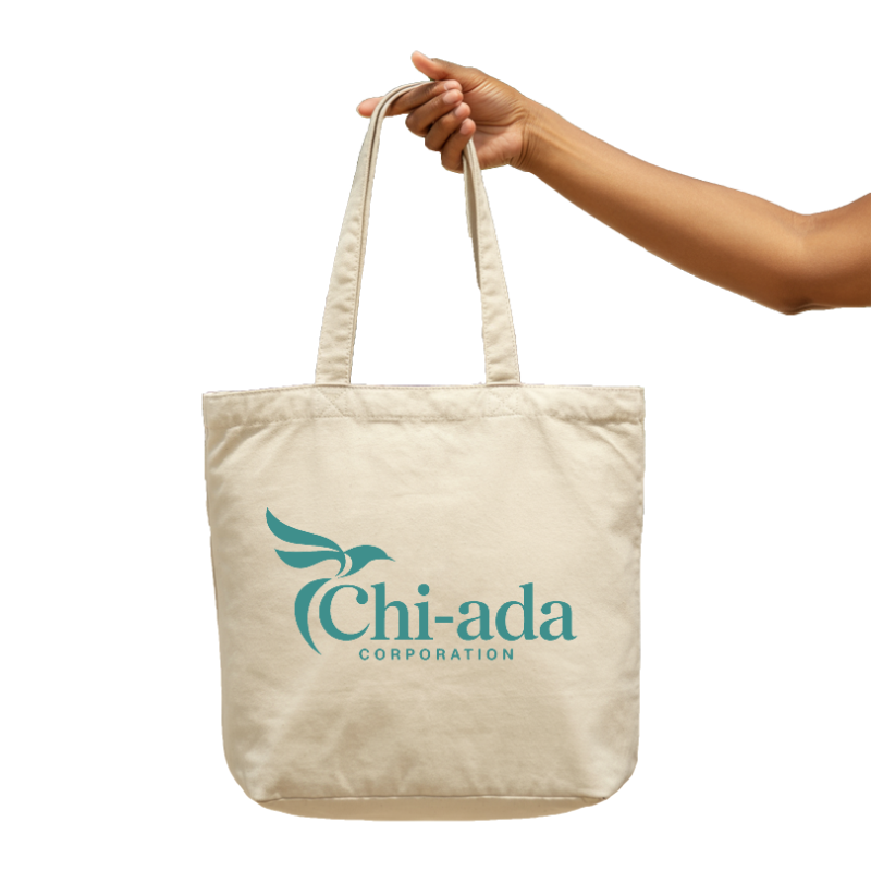
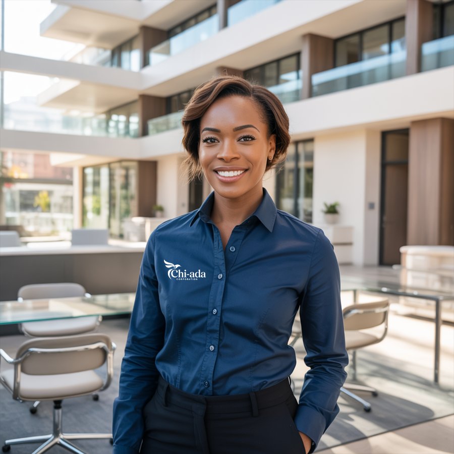
Chi-ada Corporation is a South Florida cleaning company whose original red-and-white look no longer fit the business. The goal was to go green and modern, with an identity that speaks to the industry and builds trust from the first impression.

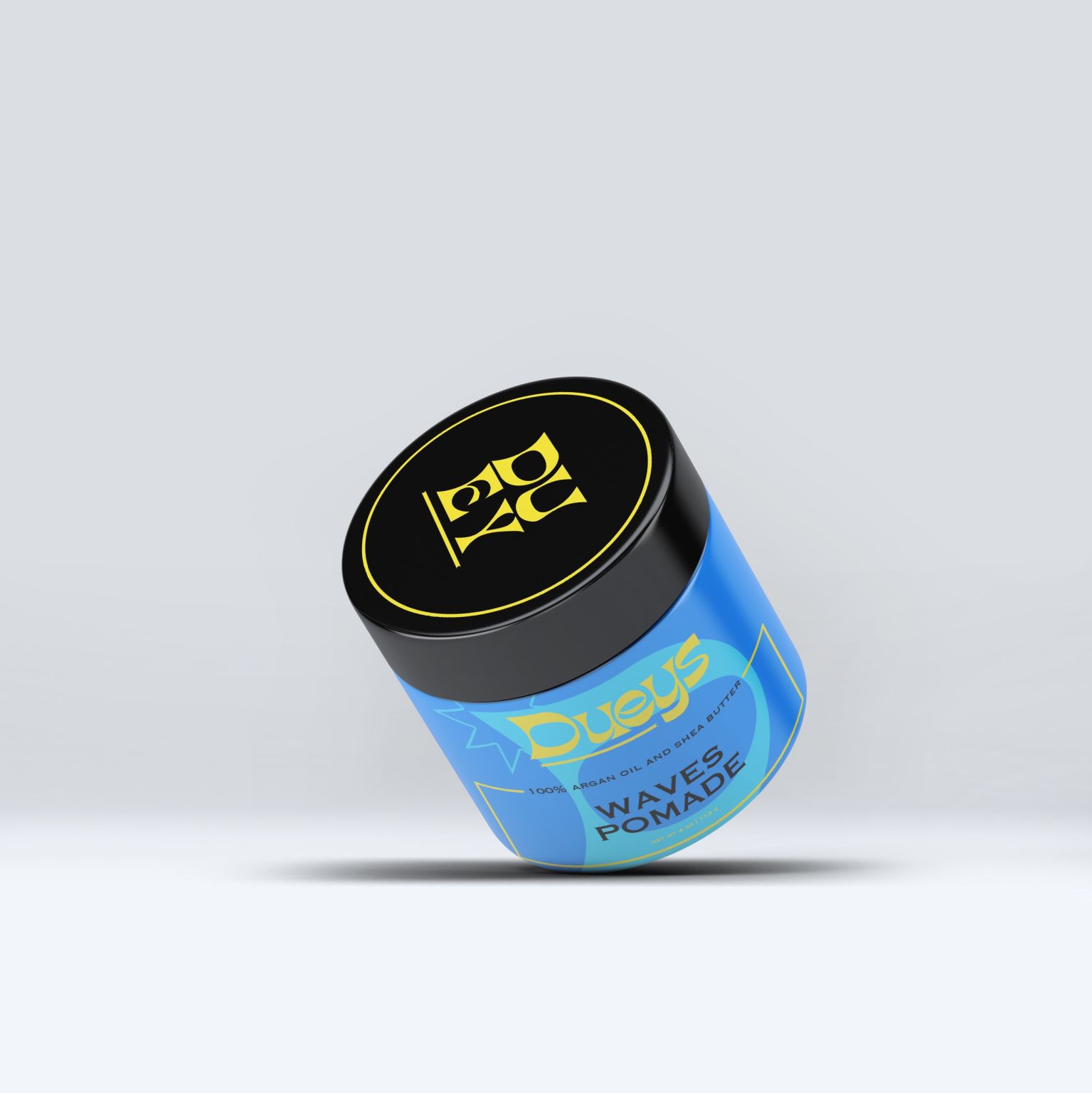
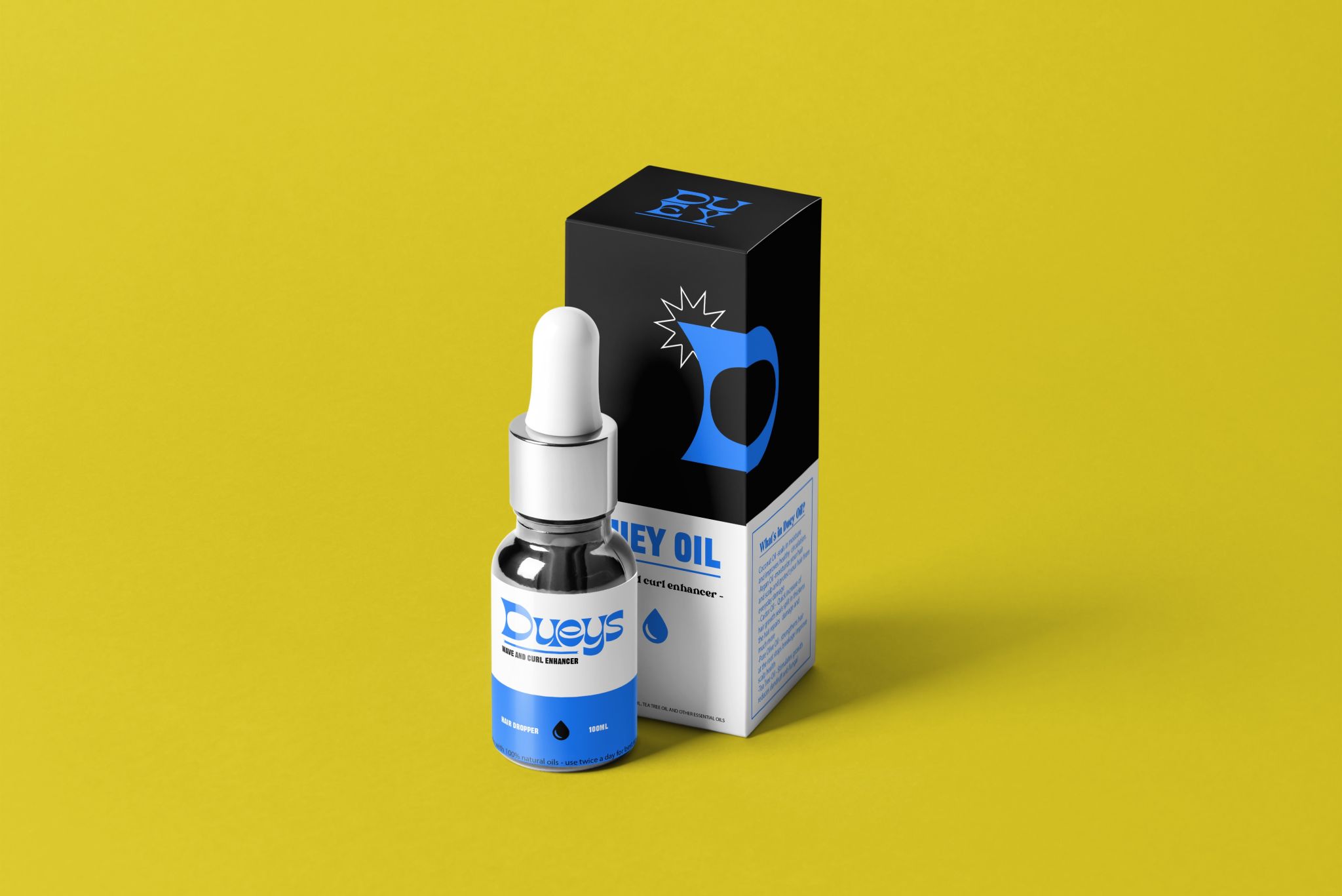
DUEYS
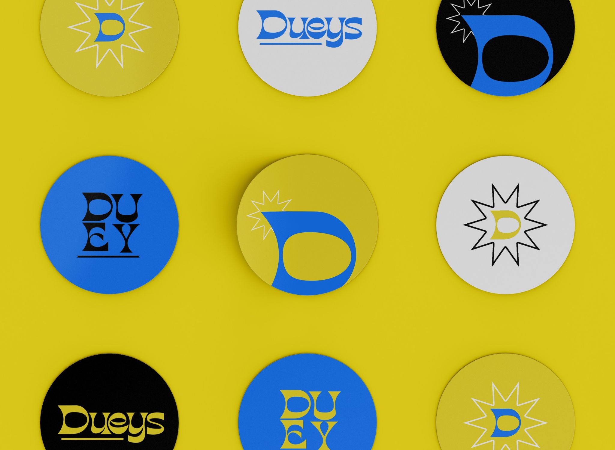
Identity and packaging concept for a durag brand.

TRSH
MAGAZINE
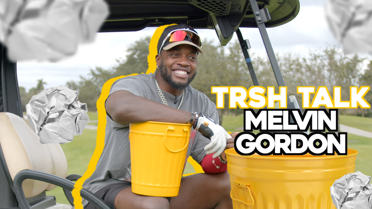
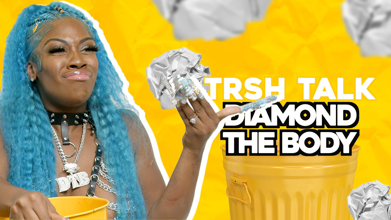
The visual system behind TRSH TALK and TRSH Mag Weekend: a recurring YouTube thumbnail format, event flyers and a sponsorship deck.
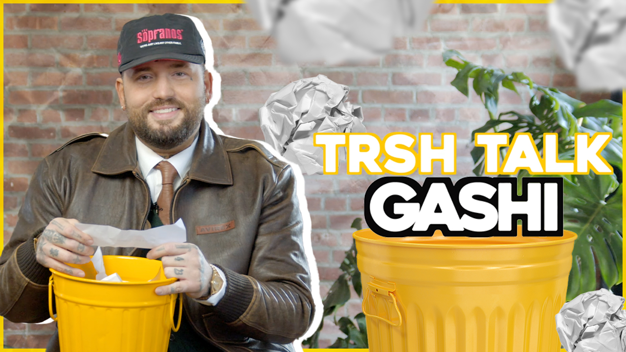

TRSH Mag is an interview and performance platform based in South Florida and New York. It needed one visual voice that could carry across Instagram and YouTube.
As the platform’s graphic designer, I built the look of both channels from the ground up: a recurring thumbnail format, a social system and event creative that all read as TRSH at a glance.
 Yellow studio
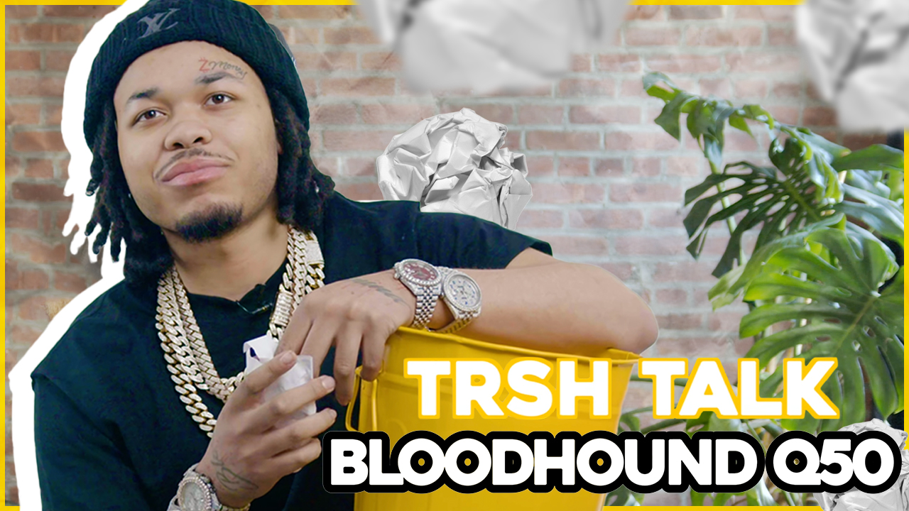 Brick studioOn location


Aurora Suites
Jamaica
Aurora Suites is a luxury Airbnb in Montego Bay, Jamaica. I joined as a freelance designer to refresh the identity so the brand would feel as polished and welcoming as the stay itself.
“The refreshed identity for Aurora Suites brings a modern vibrancy to a luxury Airbnb destination in Montego Bay, Jamaica. Brighter hues and a streamlined logo system create a polished yet inviting aesthetic, reflecting an experience that feels effortless, elevated, and rooted in island warmth.”


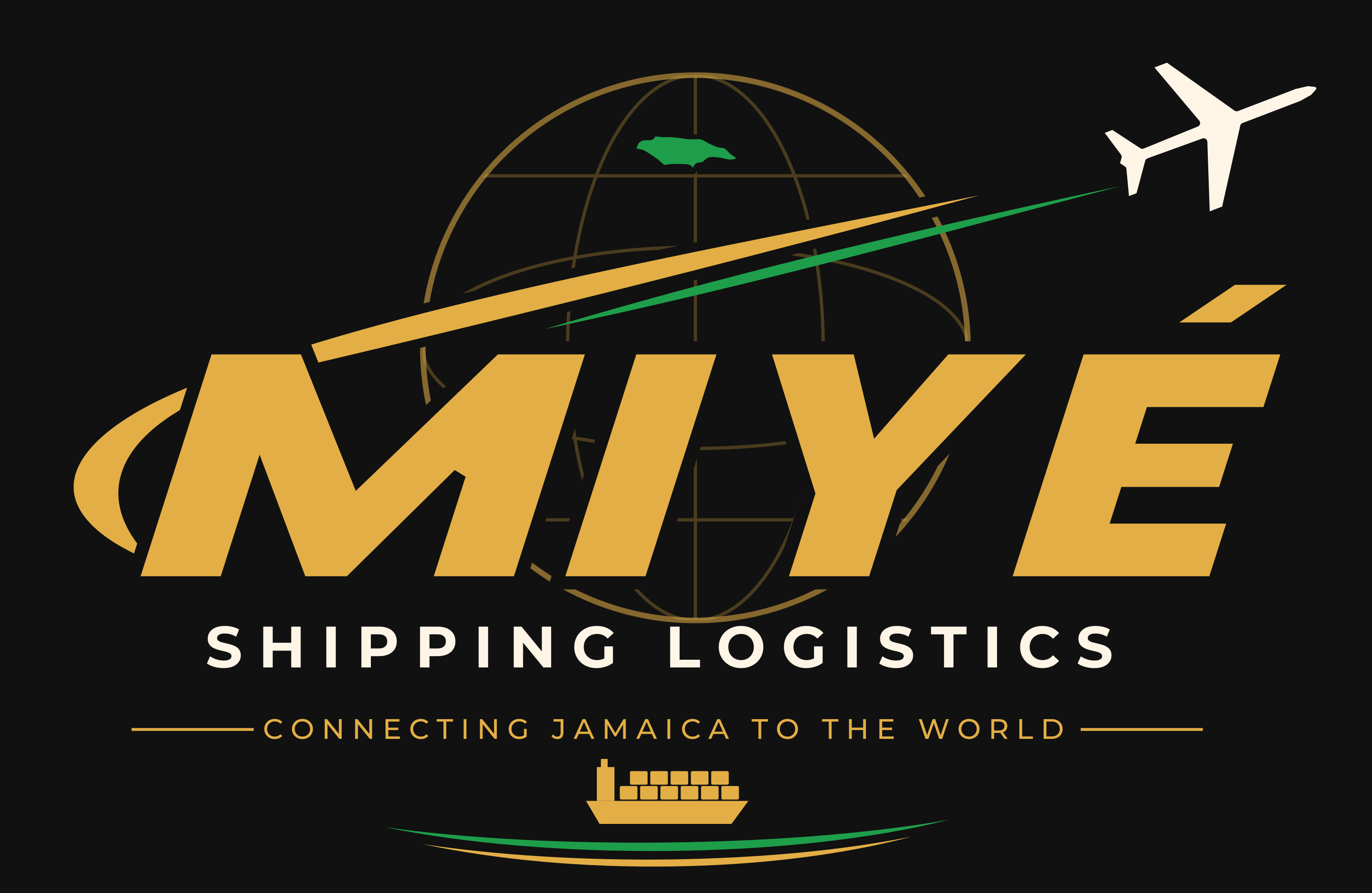
A modern identity for a shipping company that connects Jamaica to the world, and the world back to Jamaica.

MIYÉ Shipping Logistics is a US-based company that moves packages and freight from Jamaica to the world and from the world to Jamaica. The founders came to me with a rough concept they had generated with AI and full creative control to turn it into a real brand: one that could earn trust from customers on both sides of the route.
The hardest question came first: how Jamaican should it feel? A shipping company that serves the island needs to be recognized by its community, but leaning on flag colors and island clichés risked making MIYÉ look like a souvenir rather than a logistics partner. The brand had to read as global, dependable and modern, while still feeling like it came from home.

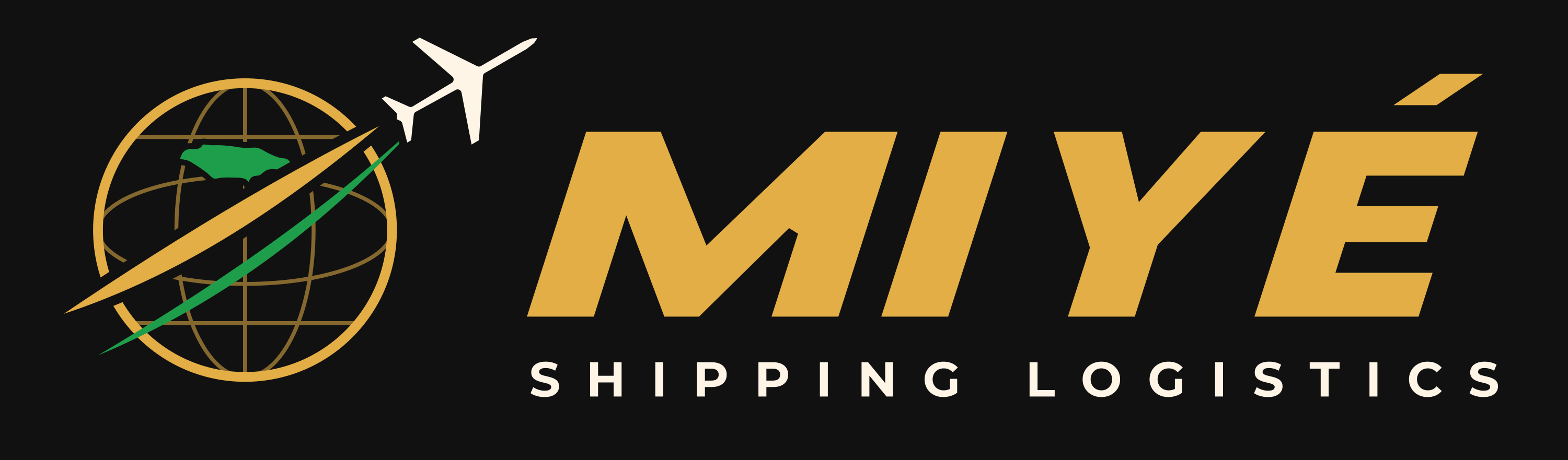




Black and cream do most of the work. Gold carries the name, and green is used sparingly so it always points back to Jamaica.
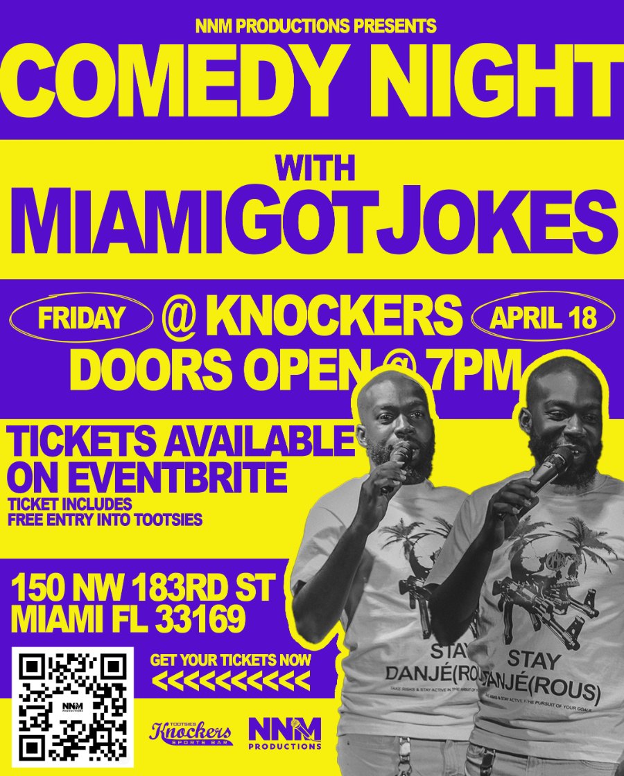
Comedy
Night
@ Knockers
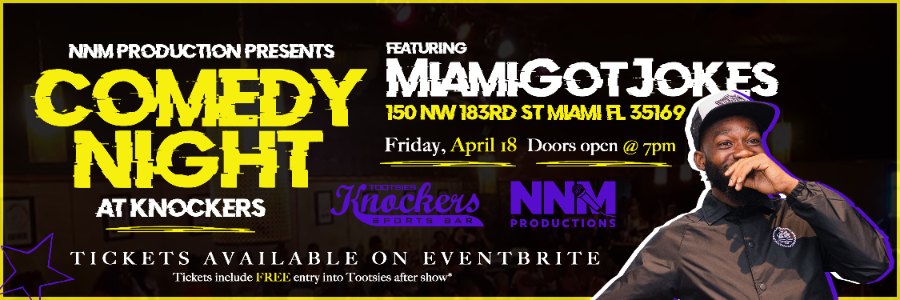
Logo and recurring event creative for NNM Productions’ comedy series at Tootsies Knockers Sports Bar, Miami.
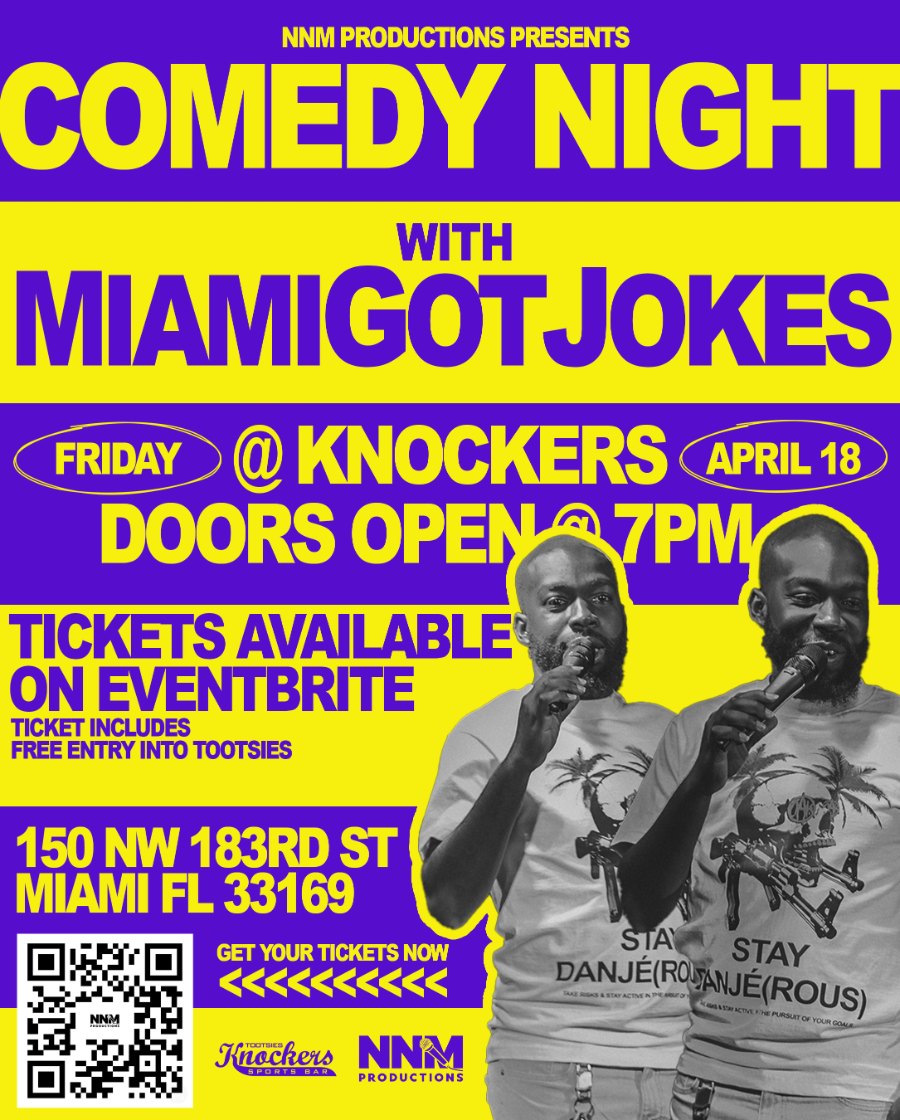
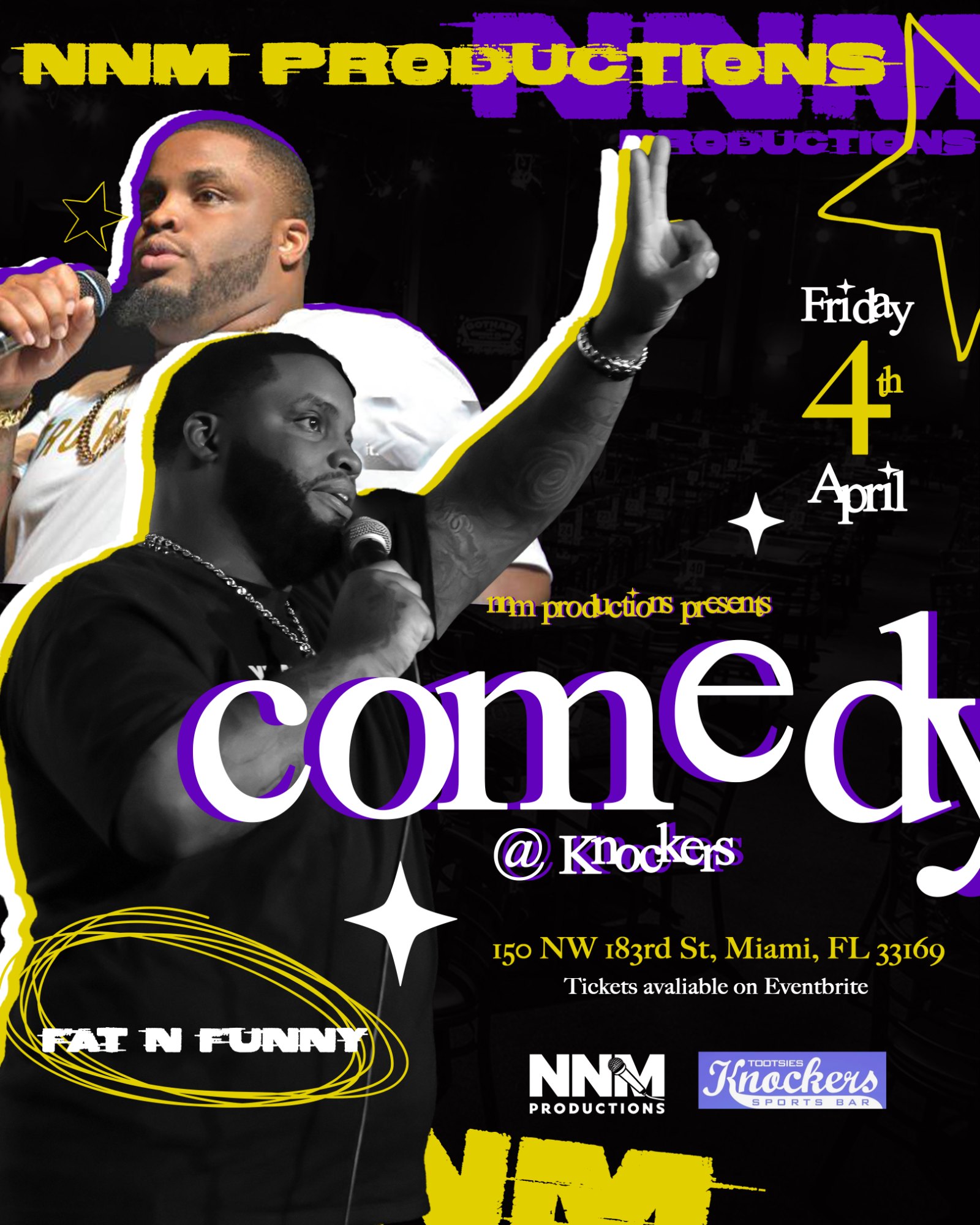
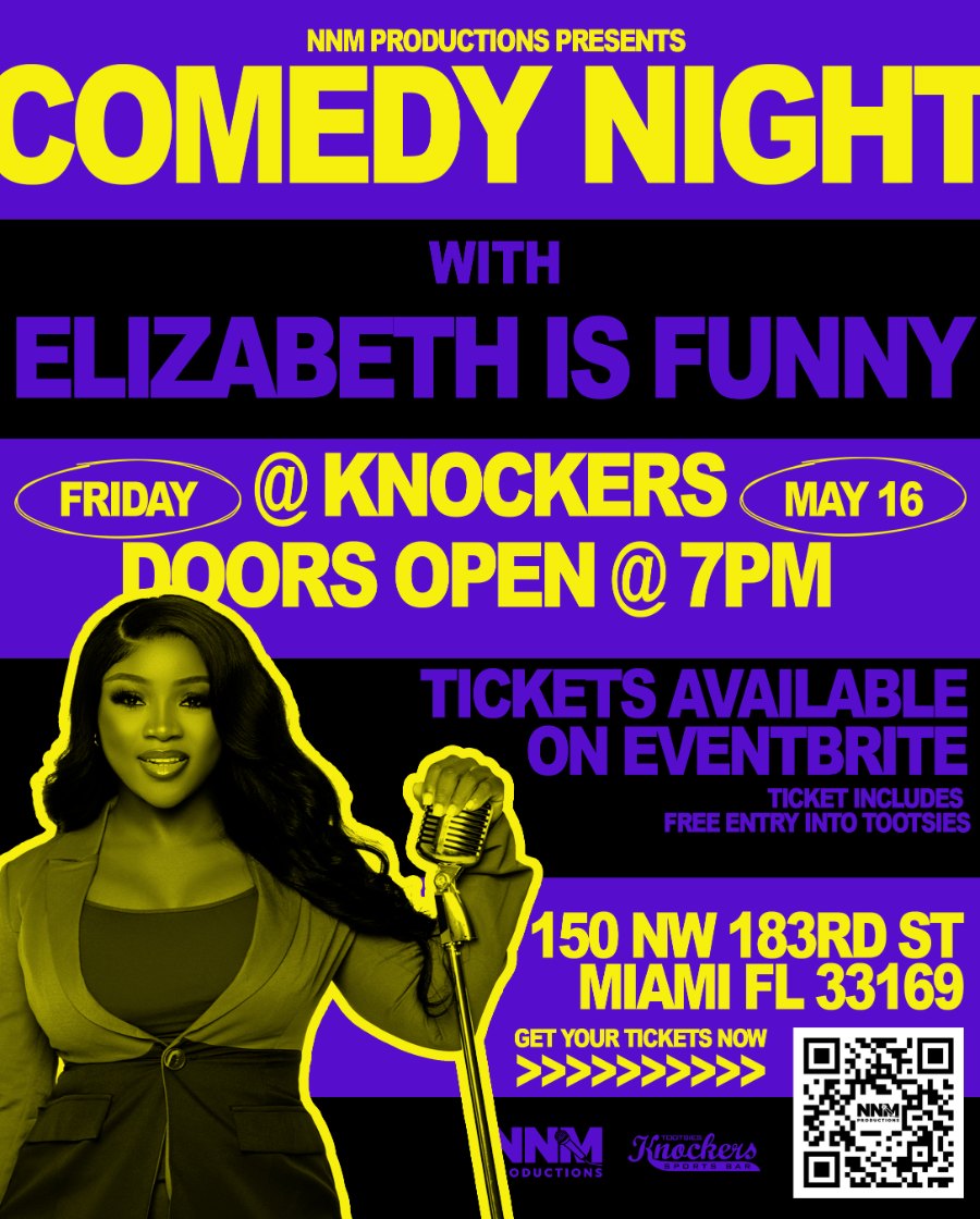
NNM Productions is a South Florida comedy and events producer. As a freelance designer, I created the company’s logo and its first set of flyers, giving the Comedy Night series a look it could repeat show after show.
LOGO
COLLECTION
Single marks for brands across beauty, wellness, nightlife, events, automotive and real estate.

EVENT
FLYERS
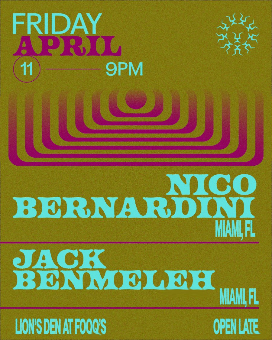
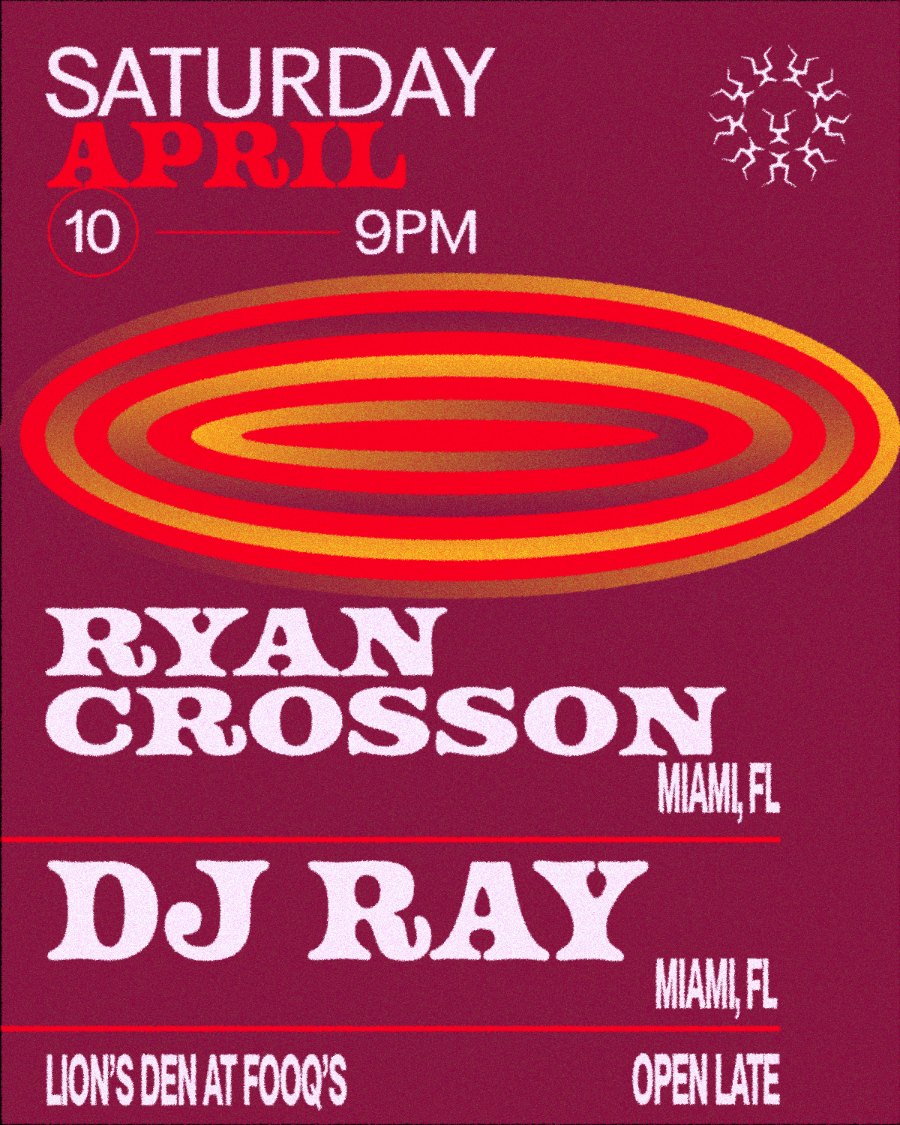
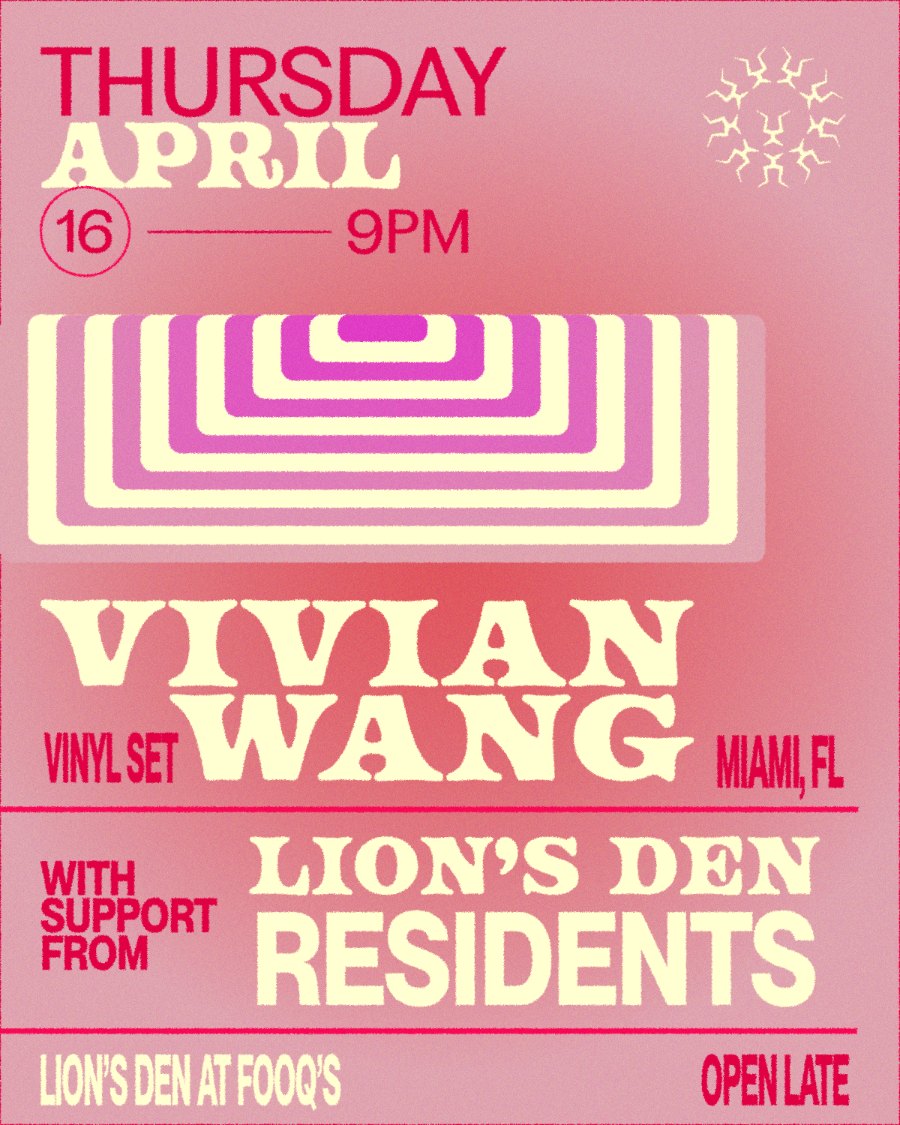
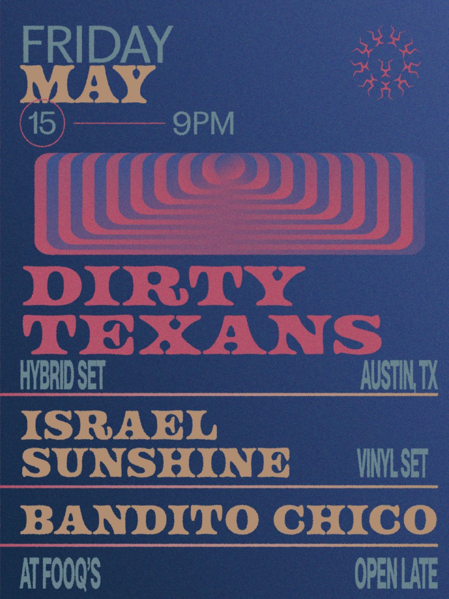
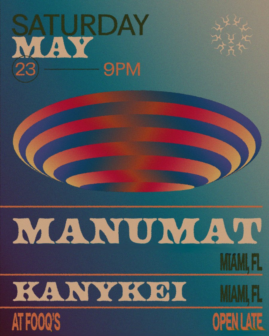
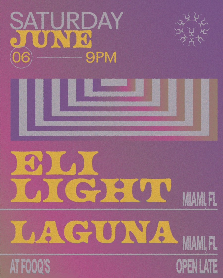
17 flyers across 6 events. Each one is tagged by what it had to do: lineup, headliner, ticket push, teaser or social post.
LION'S DEN
Upstairs club at Fooq's · Miami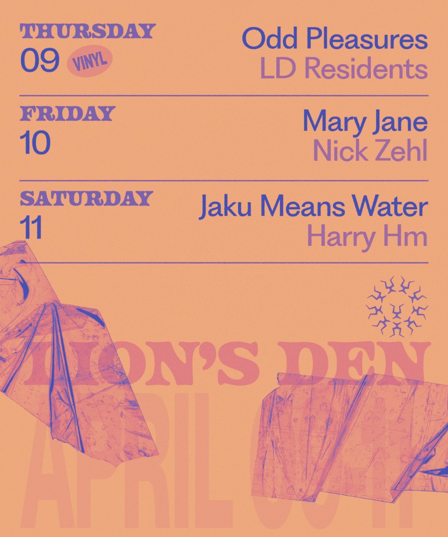
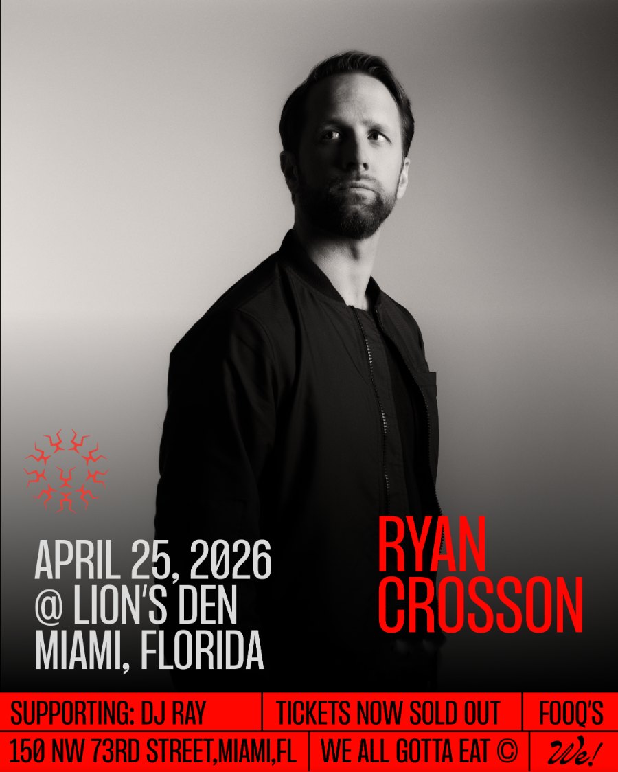
NNM PRODUCTIONS
Comedy nights at Knockers · Miami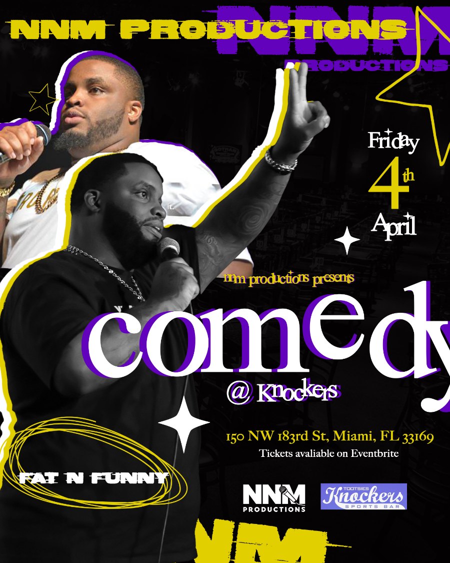
T.O.K LIVE
Jamrock Starz · Crown Hill Theatre, Brooklyn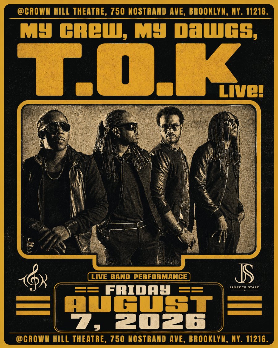
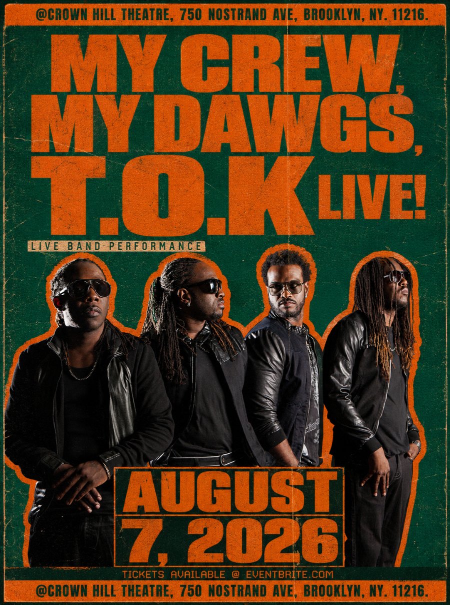
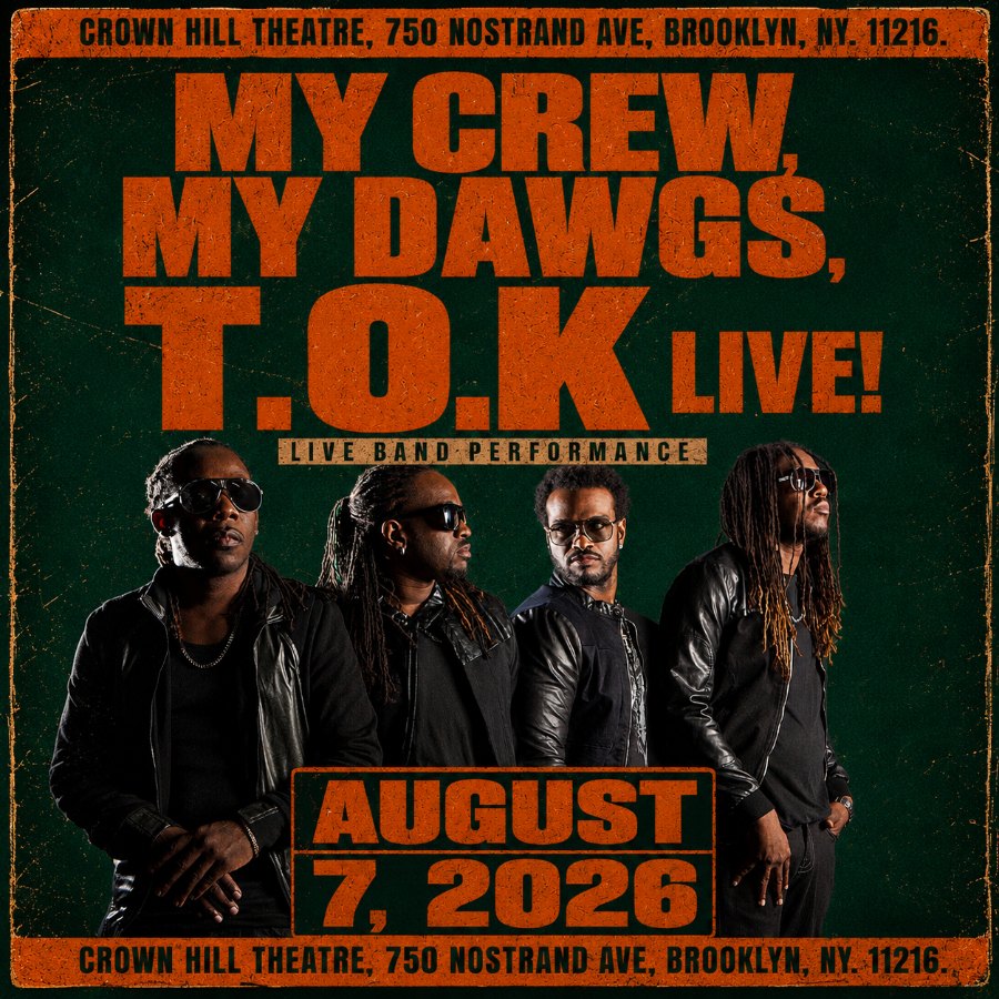
VP RECORDS
Rebel Daawta Live · Brooklyn + Miramar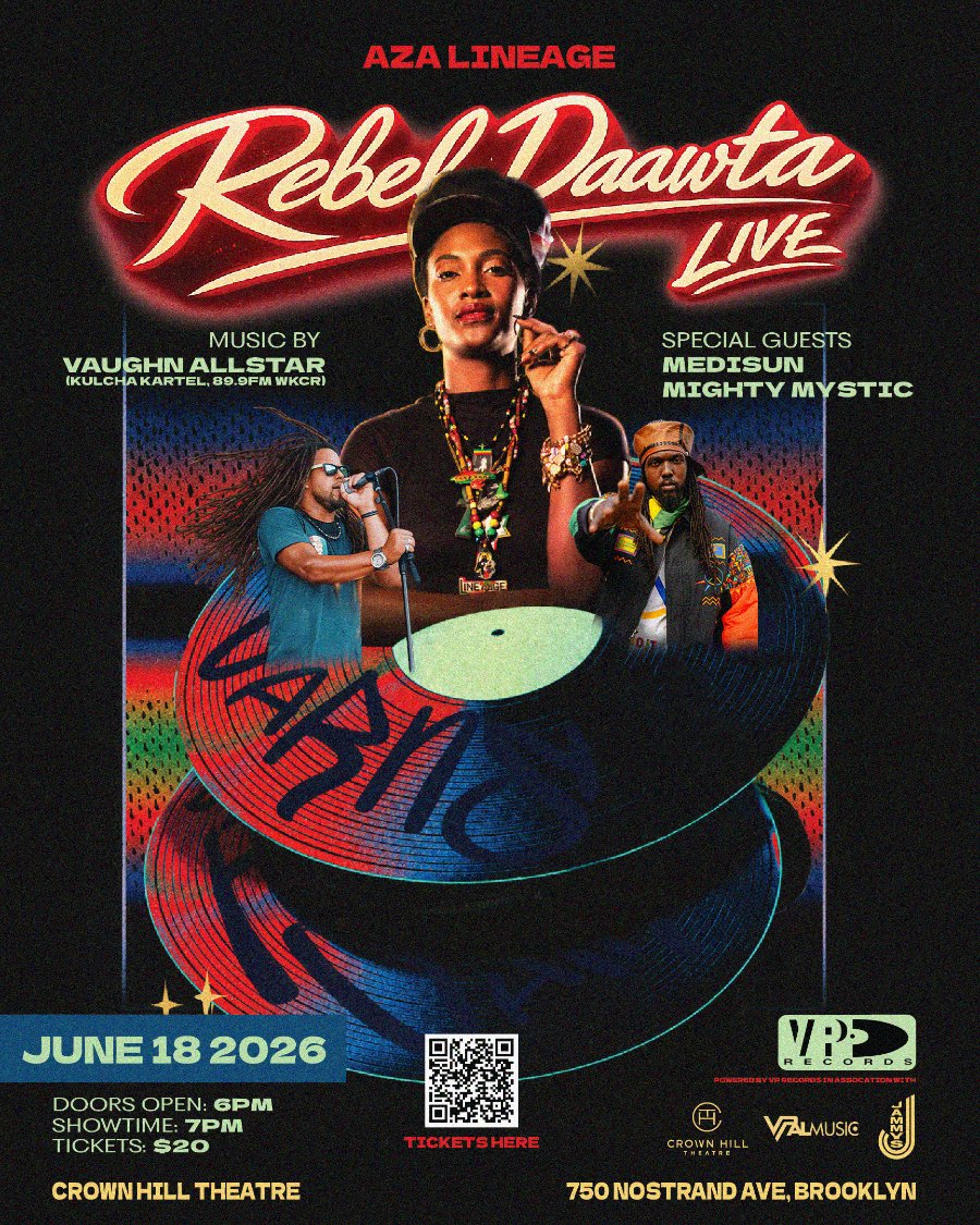
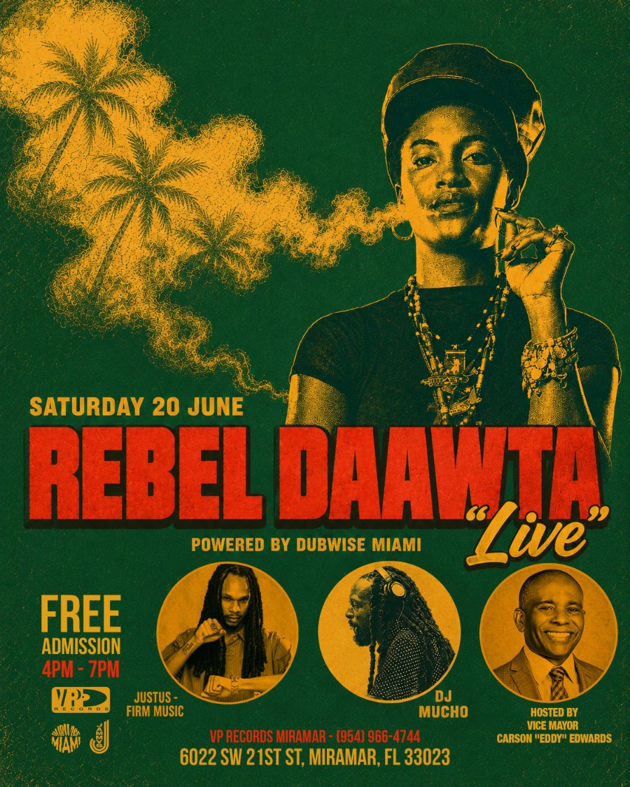
FLOWER BOMB
The Brunch Party · South Florida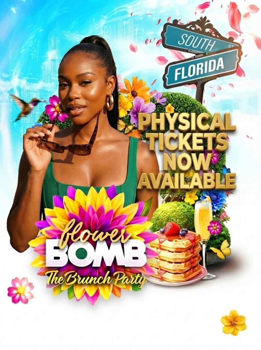
DON'T BE SHY
South Florida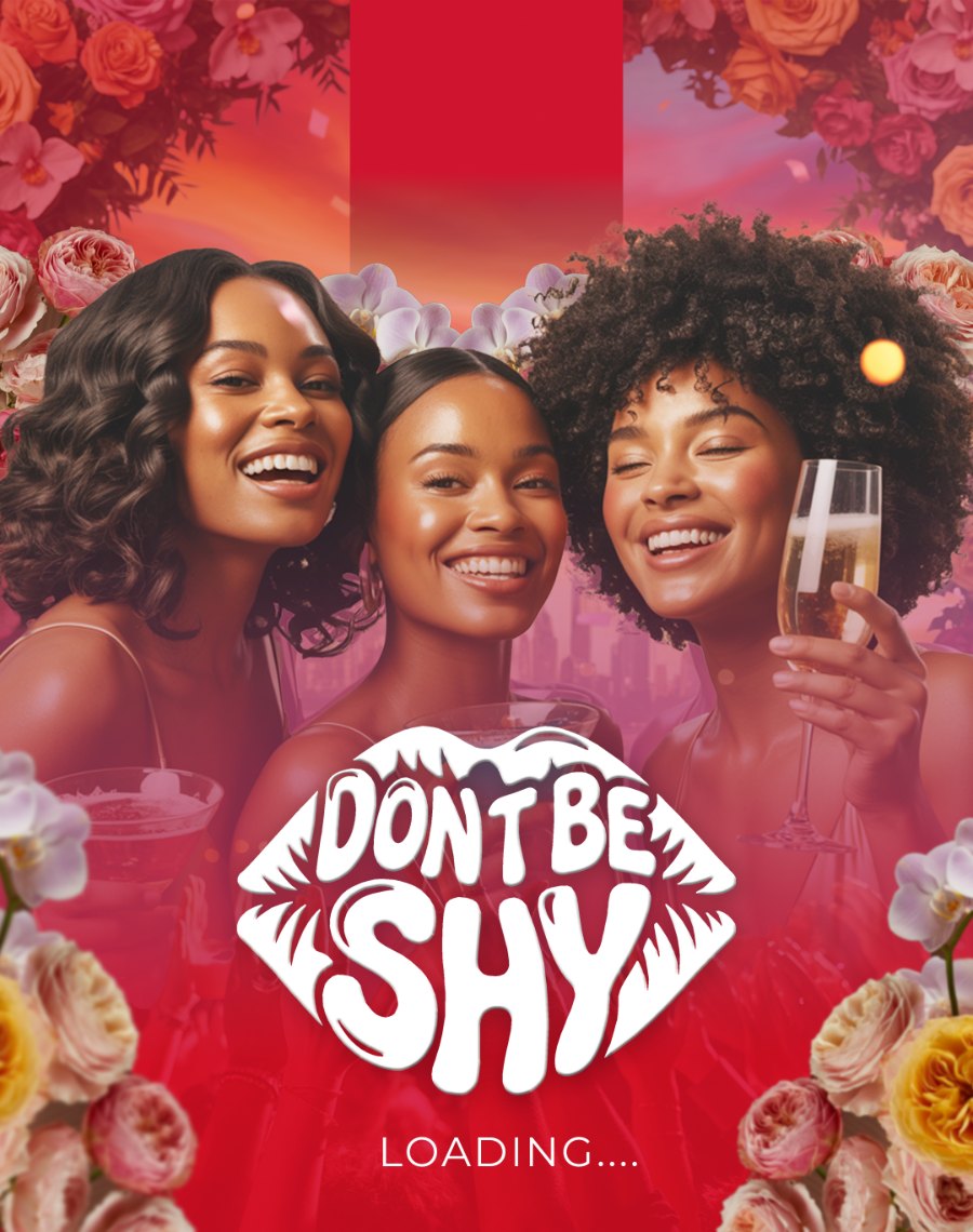
Marketing
for The
Source.
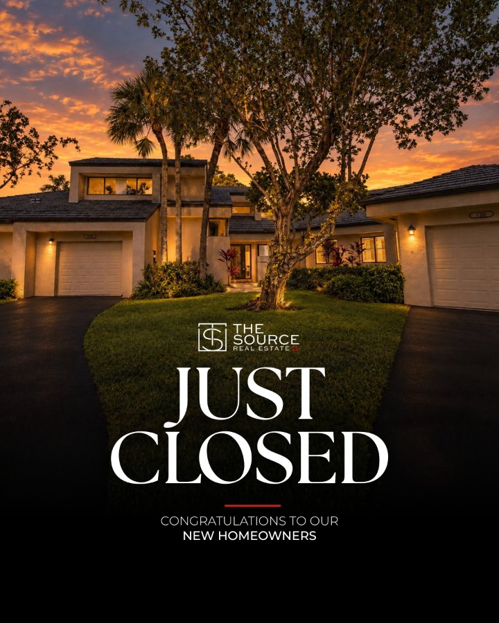
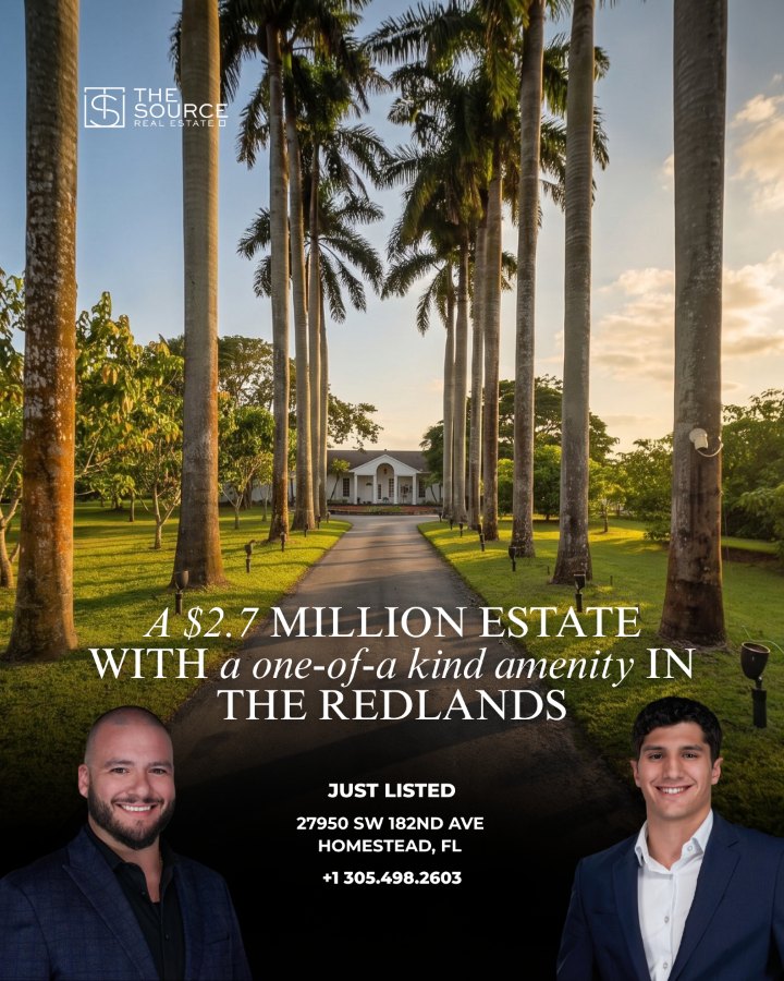
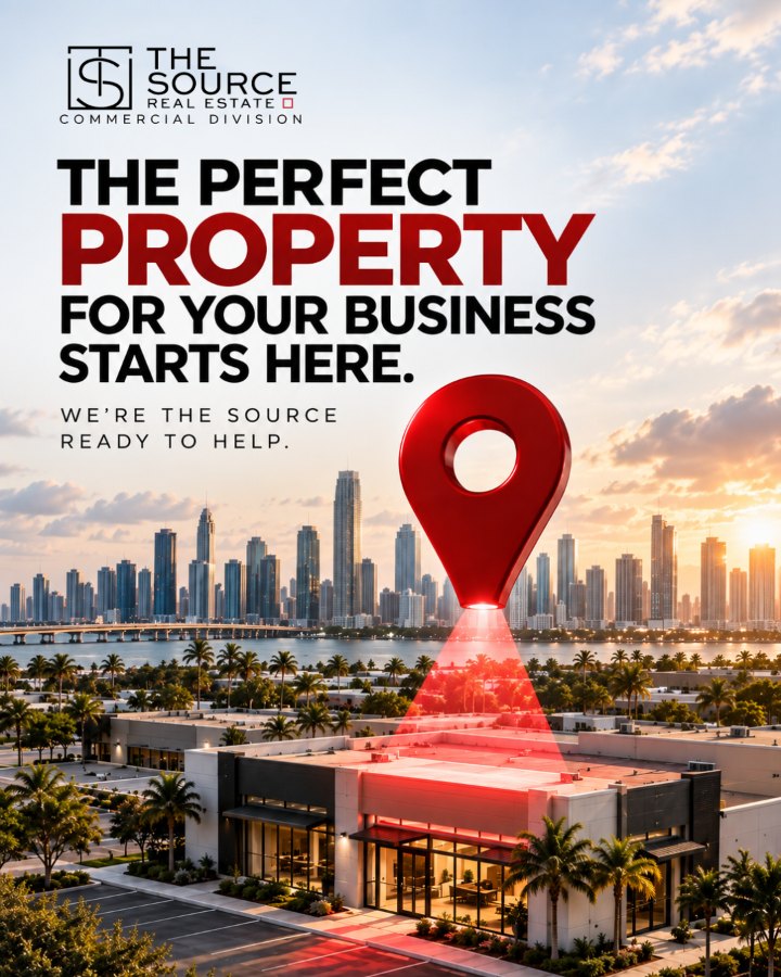
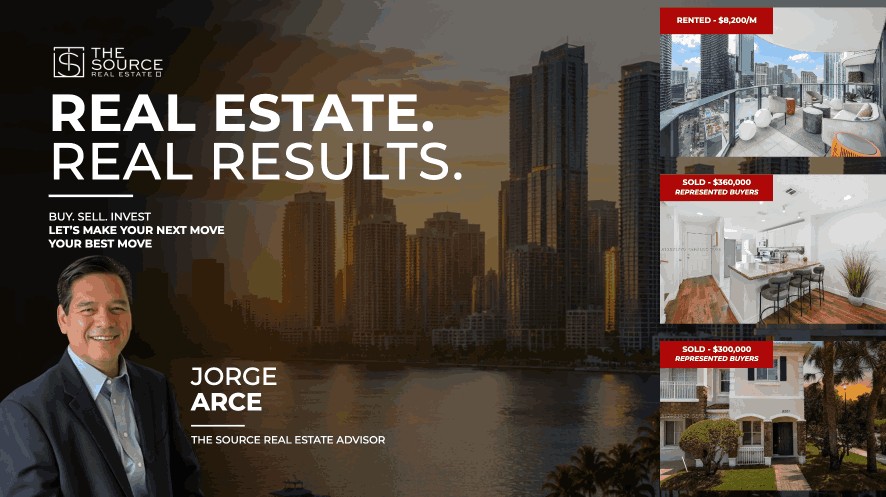
The Source Real Estate is a South Florida brokerage. As Marketing Director, I design the brokerage’s Instagram content, short-form video and the printed mailers its agents send to buyers and sellers. Every piece runs on the same black, white and red identity, so a listing, a closing or a mailer reads as The Source first and the individual agent second.

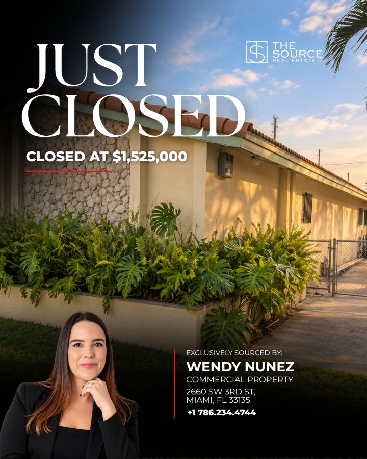
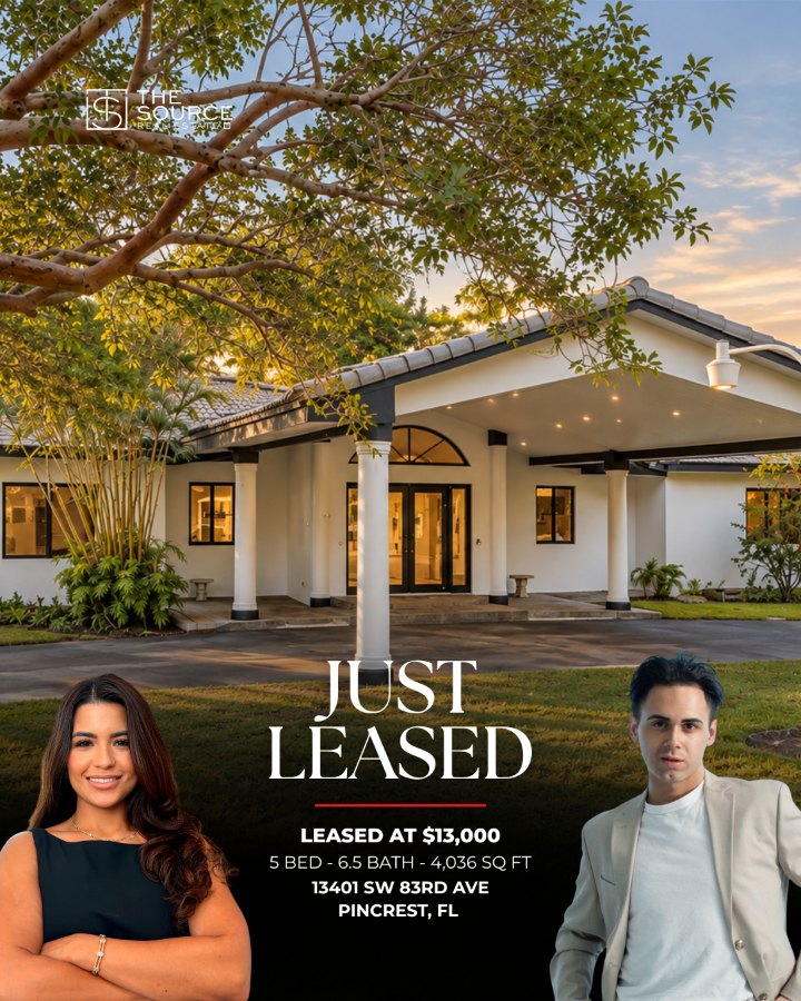
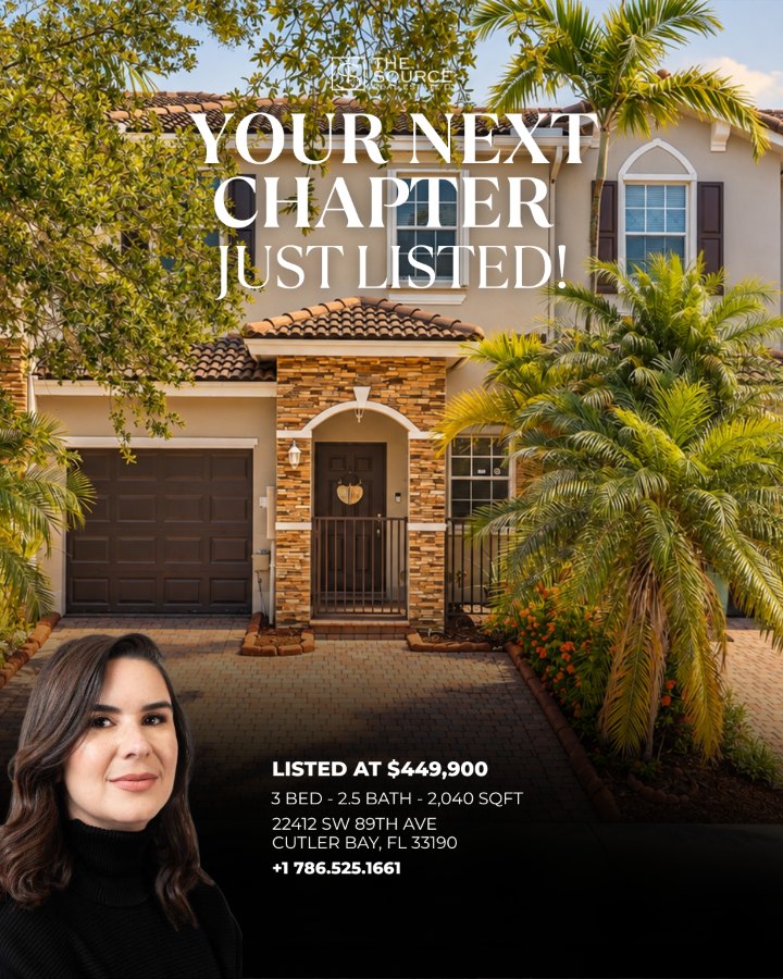
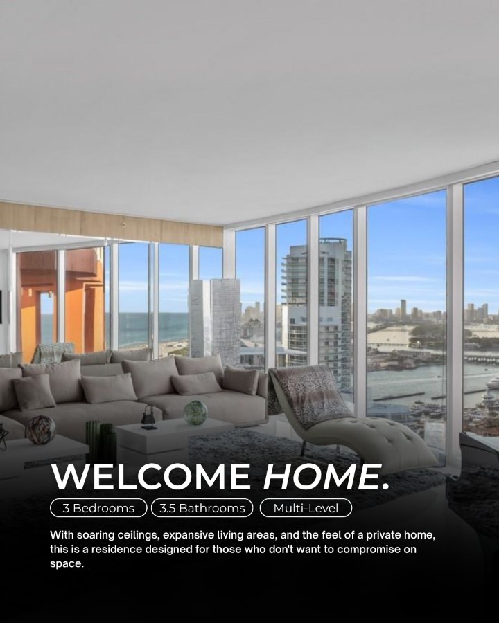
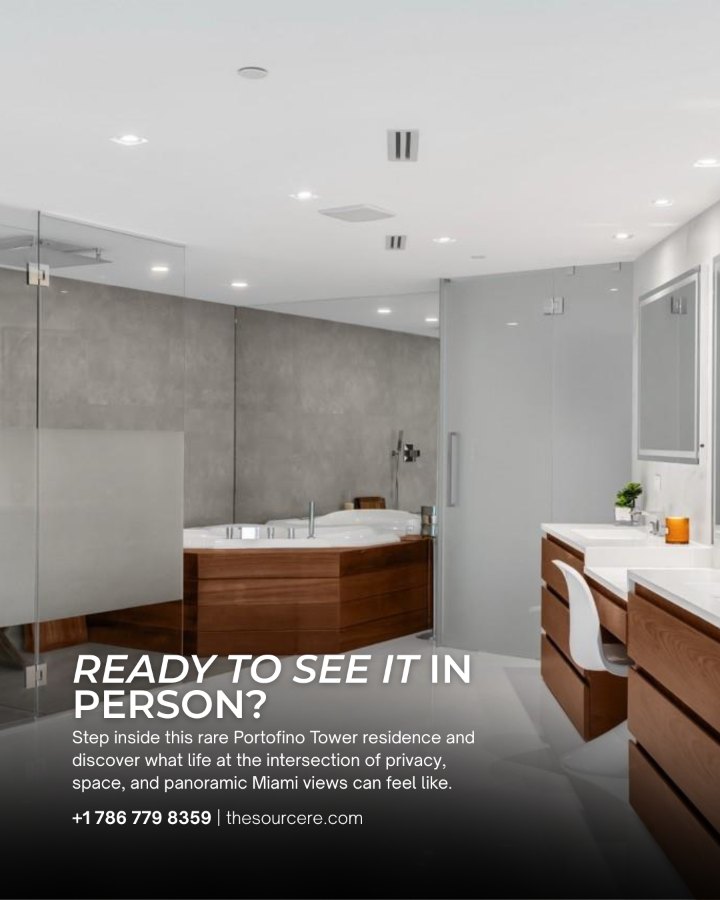
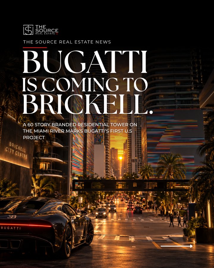
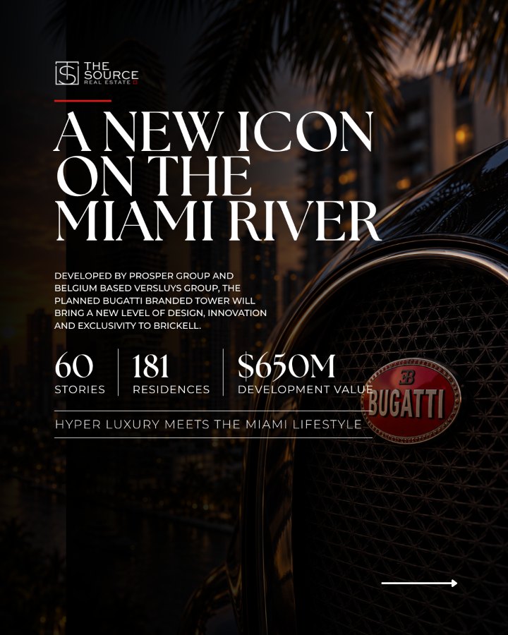
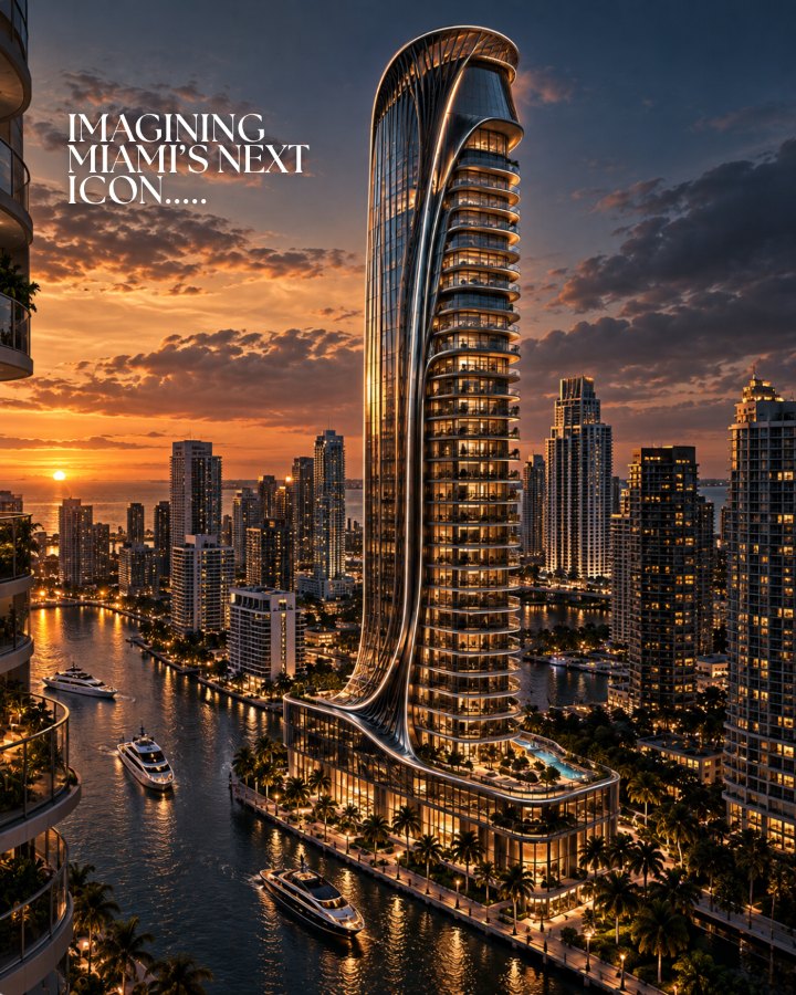
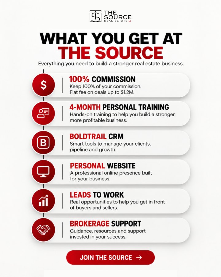
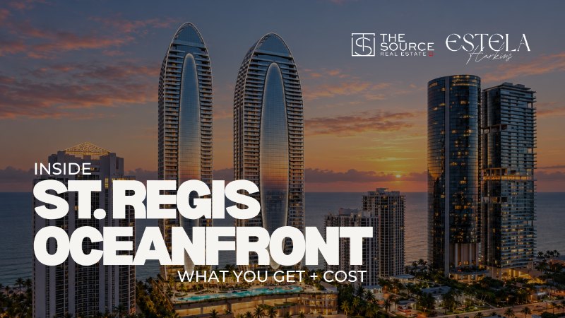
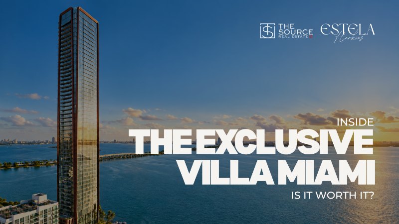
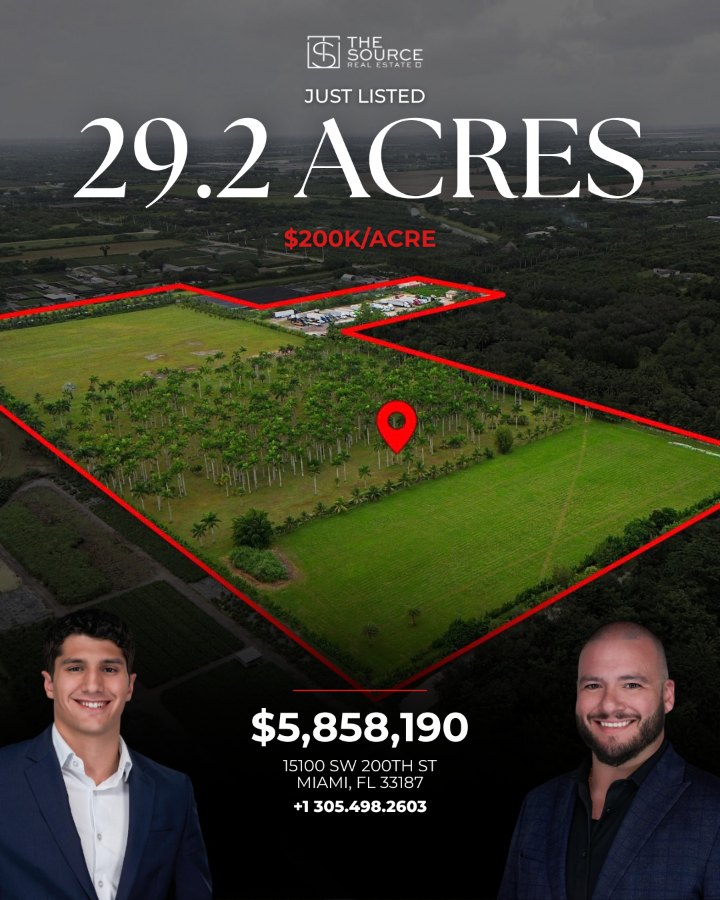
Instagram posts, grouped by what each one does. Results posts and listings share one structure: a serif headline over the property photo, a red rule, then the details and the agent.
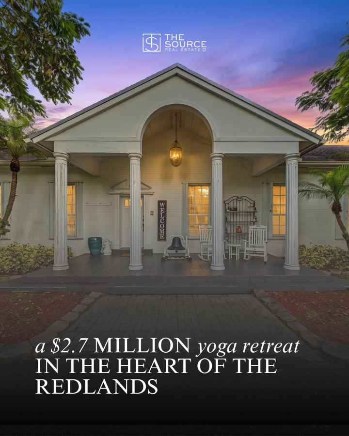
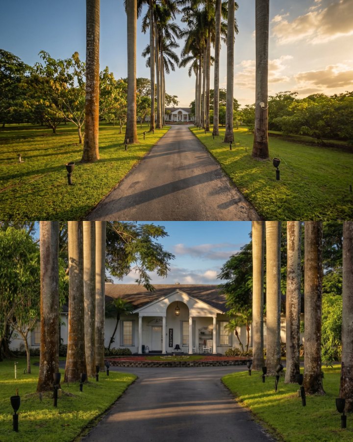
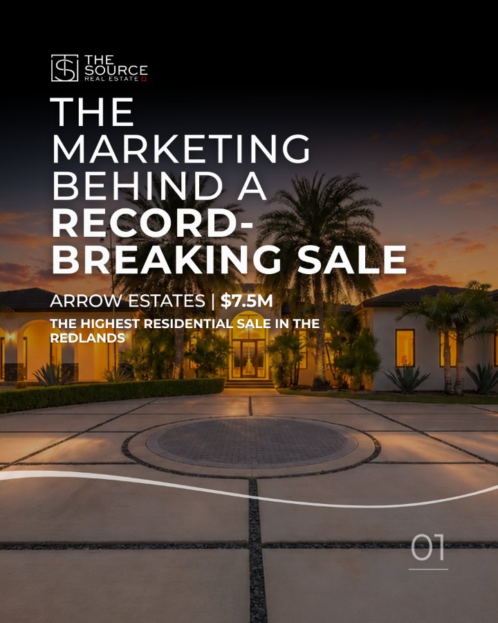
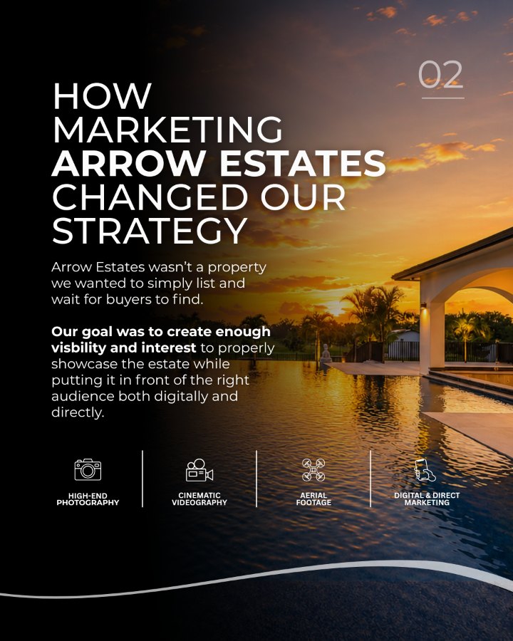
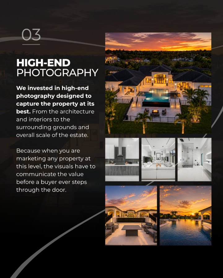
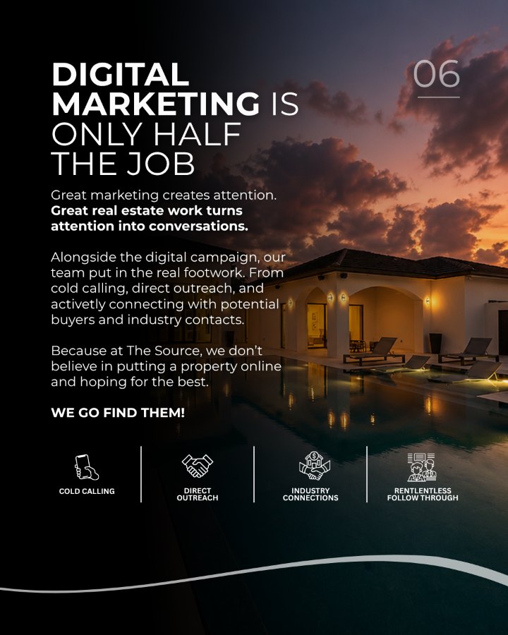
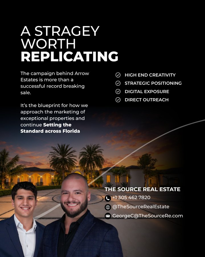
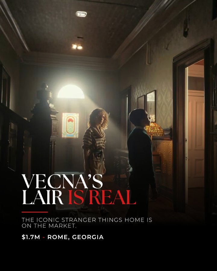
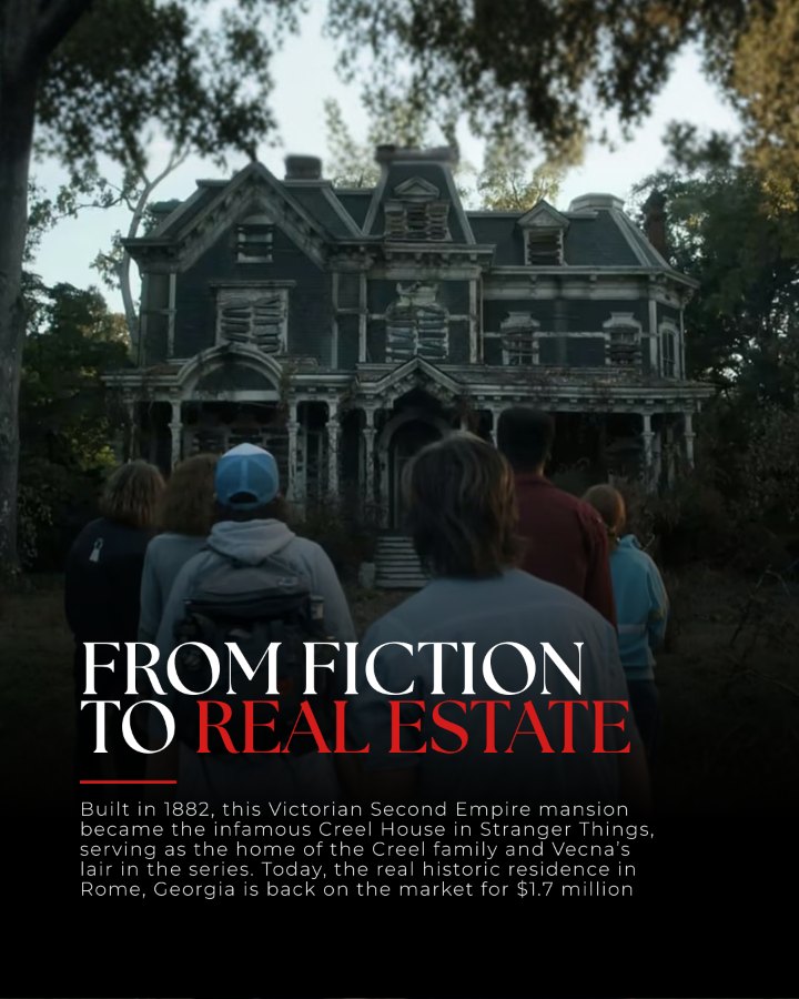
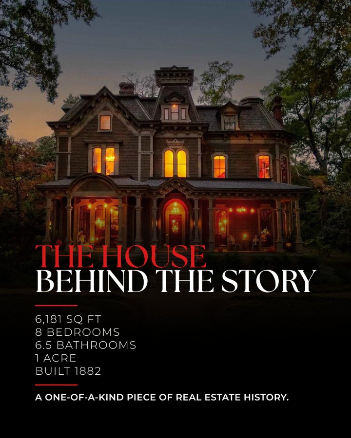
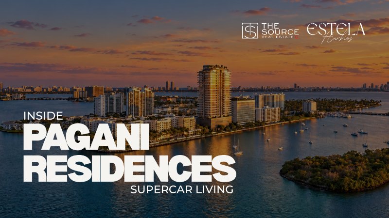
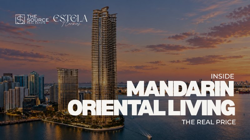
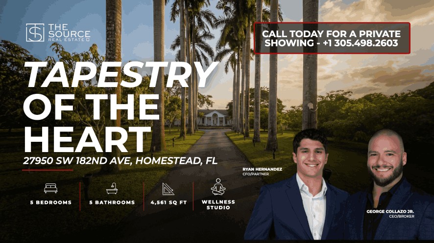
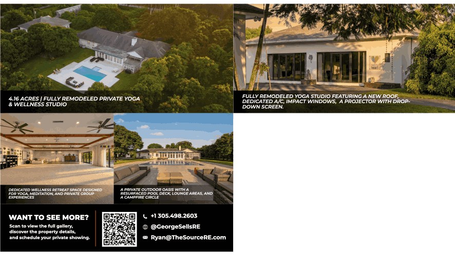
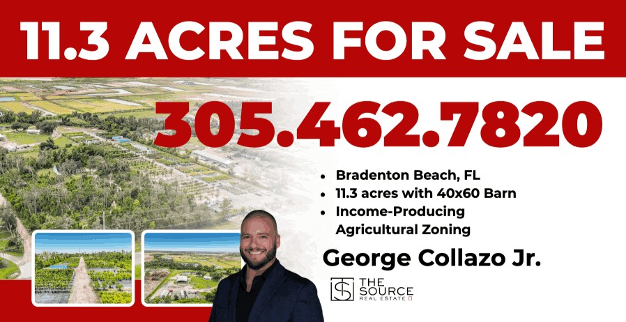
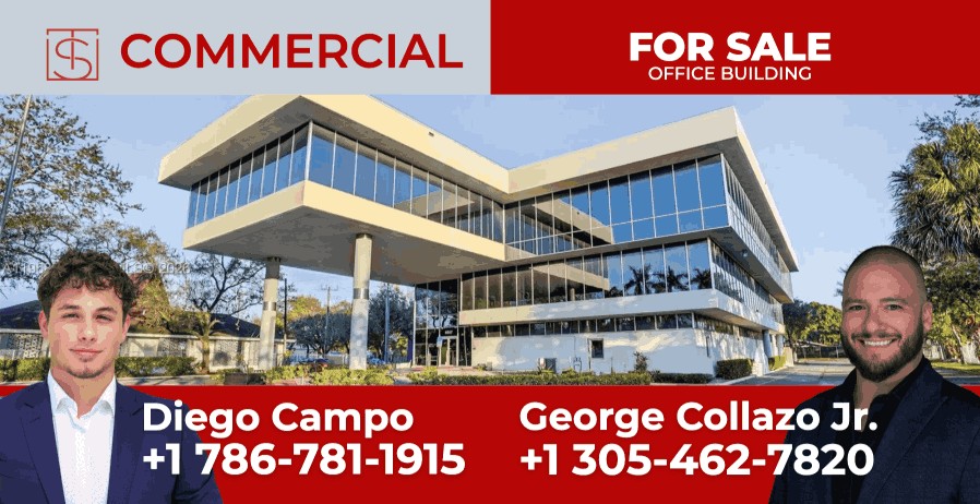
The front leads with the property and the two listing agents. The back walks through the grounds and the wellness studio and closes with a QR code to the full gallery.
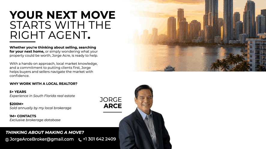
The front pairs the agent with three recent results. The back explains his approach and why a local agent matters, with direct contact details at the bottom.
Websites I’ve
designed + built.
Join The Source
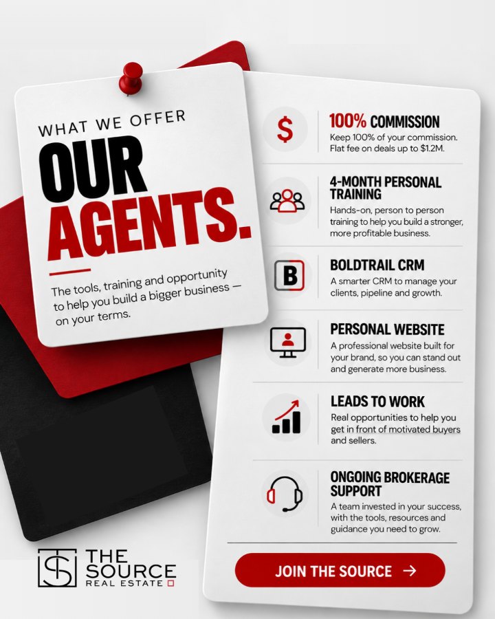
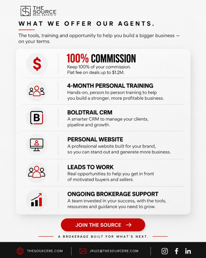
The brokerage’s agent recruiting site. It lays out the flat-fee commission model, what agents get, the in-house tech, the culture and the agent directory, and ends in a confidential inquiry form.
The Source Playbook
A case study site for Arrow Estates, the $7.5M Redlands sale. It pairs the property film and aerial footage with the photography, the 100-day timeline and a seller inquiry form.
Spanish Valdez
A single-listing site for a 10-acre estate in the Redland. It covers location, grounds, the residence gallery and fact sheet, with a private tour request.
Miami Dade Helps
The brokerage’s renters-to-buyers lead site. It speaks to Miami-Dade renters who are ready to own and turns their interest into buyer leads for Source agents.
W Fleet
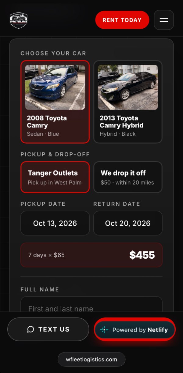
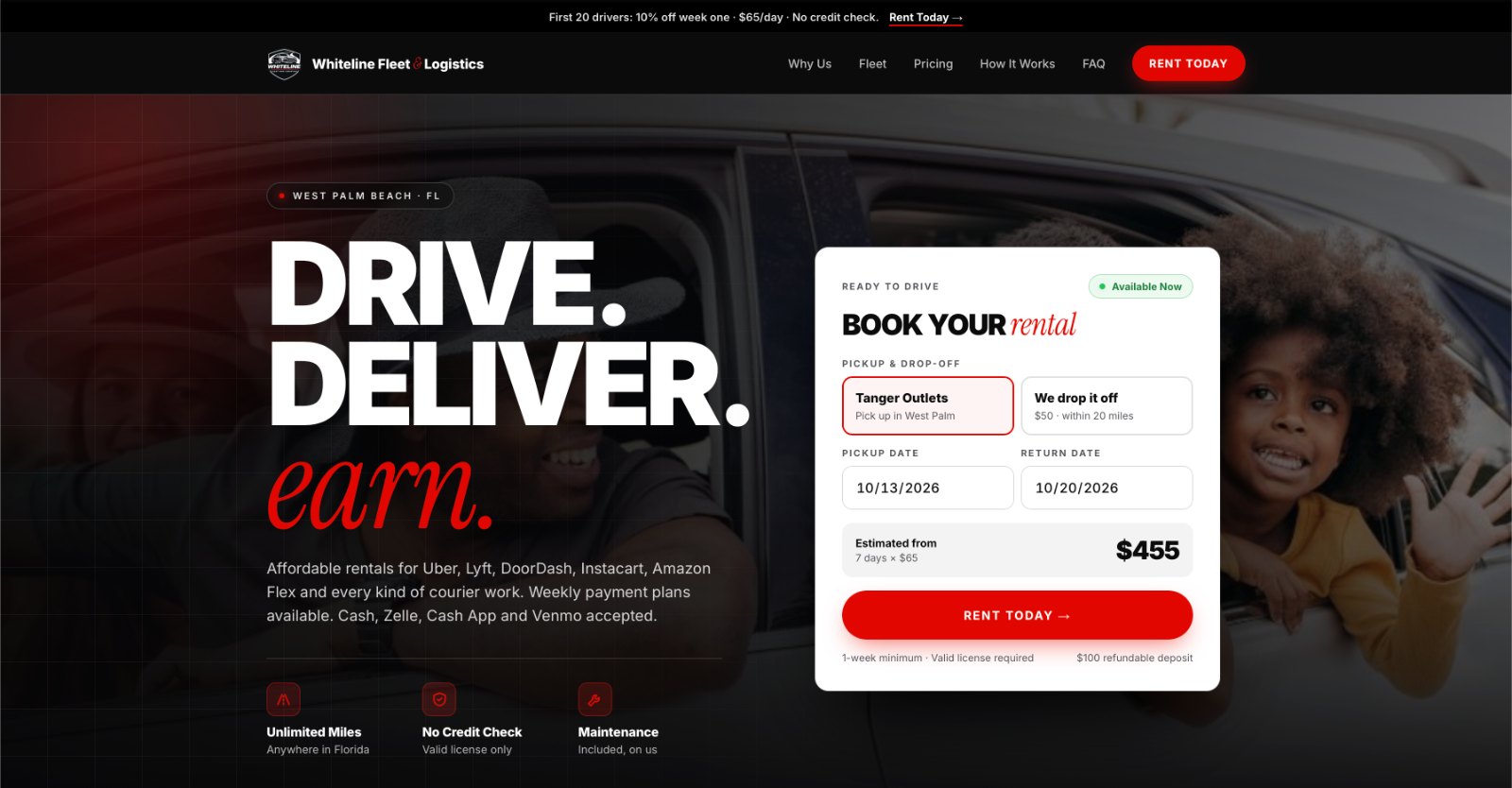
A site for W Fleet, a West Palm Beach car rental company that rents to rideshare and delivery drivers. It presents the fleet and rental options and helps drivers get on the road quickly.
Laura Abreu & George Collazo Jr.
A listing presentation site for two Source agents to share with sellers. It walks through their recent sales, the Arrow Estates campaign, property films and listing websites, and their six-step selling plan, with call and text buttons for each agent.
EVENT
ACCOUNTS
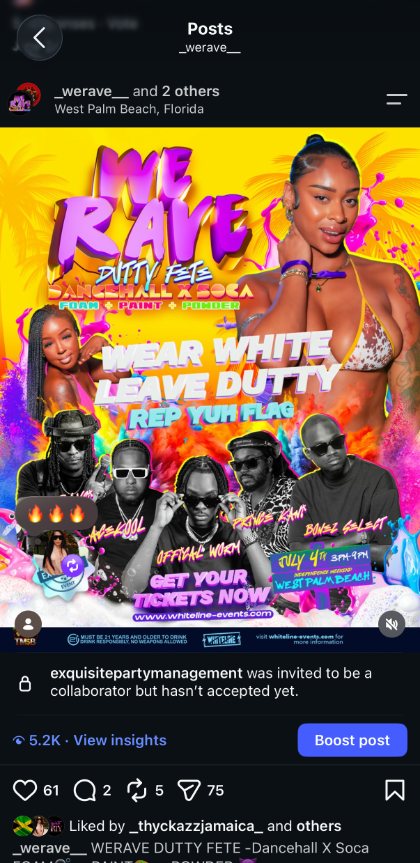
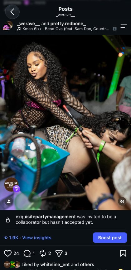
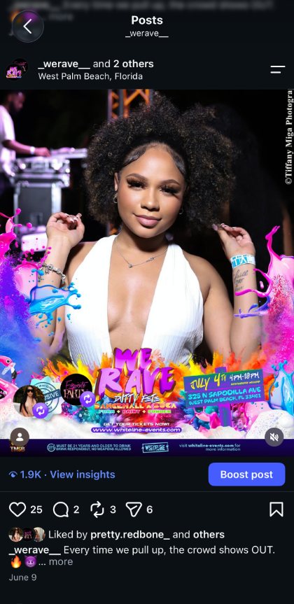
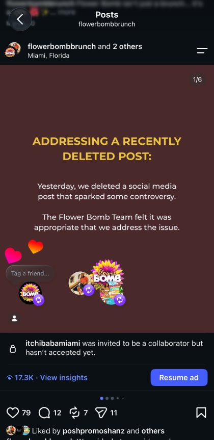
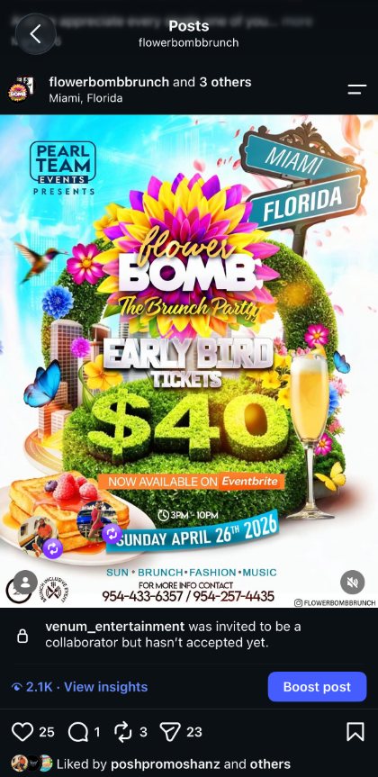
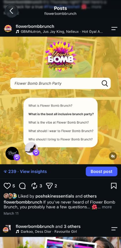
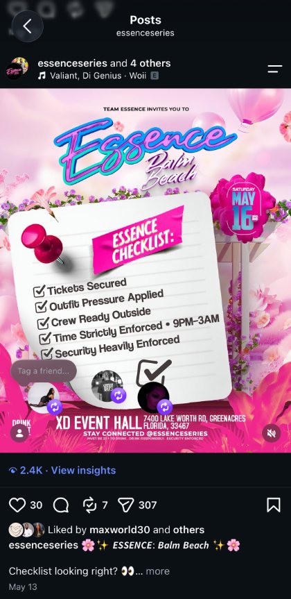
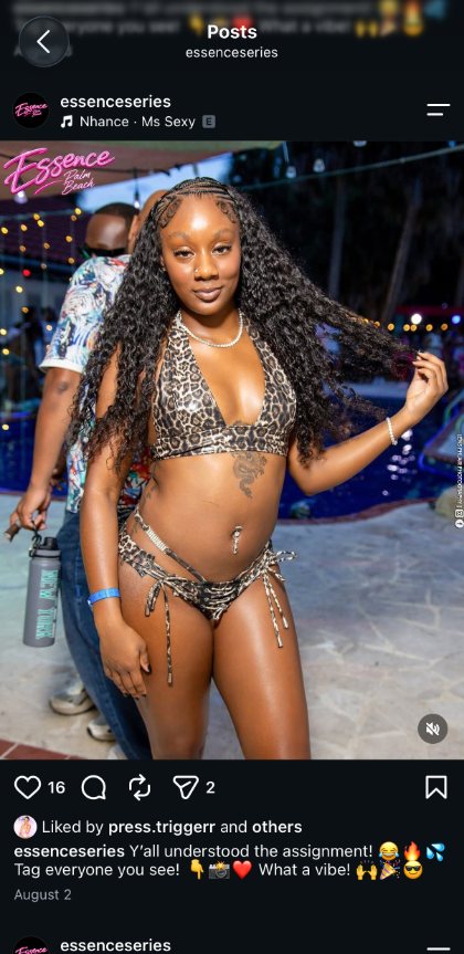
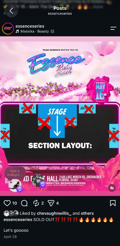
Instagram accounts I manage for three South Florida event series: the flyers, the recap posts and the announcements that keep each series in front of its crowd between events.
WERAVE
@_werave__West Palm Beach, FLDancehall × soca · foam, paint + powder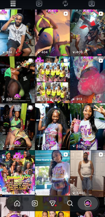
FLOWER BOMB
@flowerbombbrunchMiami + Fort Lauderdale, FLThe Brunch Party · brunch, fashion + music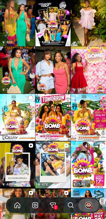
ESSENCE
@essenceseriesPalm Beach, FLEssence Palm Beach · day + night parties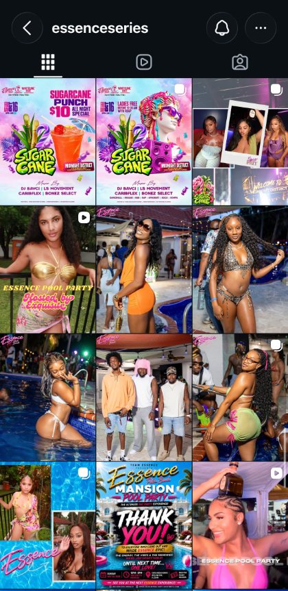
VISION →
EXECUTION
What each brand needed to become, and the work I made to get it there.
The Source Real Estate
MARKETING DIRECTOR · MARKETING SYSTEMMake every listing, closing, mailer and recruiting ad read as The Source first and the individual agent second, so the brokerage builds recognition with every post.
One black, white and red system across Instagram posts, carousels and reels, agent mailers, 8×4 property signs, recruitment ads and four websites, including a recruiting site and a renters-to-buyers lead site.
TRSH Magazine
GRAPHIC DESIGNER · SOCIAL SYSTEMGive an interview and performance platform one visual voice that holds across Instagram and YouTube, so every upload reads as TRSH at a glance.
A recurring TRSH TALK thumbnail format, a social system for both channels, and TRSH Mag Weekend event creative: flyers and a sponsorship deck.
Willow Springs at Providence
FREELANCE · REBRANDPosition a housing development in Guyana as calm and luxury-driven, rooted in the country’s landscape, so new homeowners feel at ease the moment they arrive.
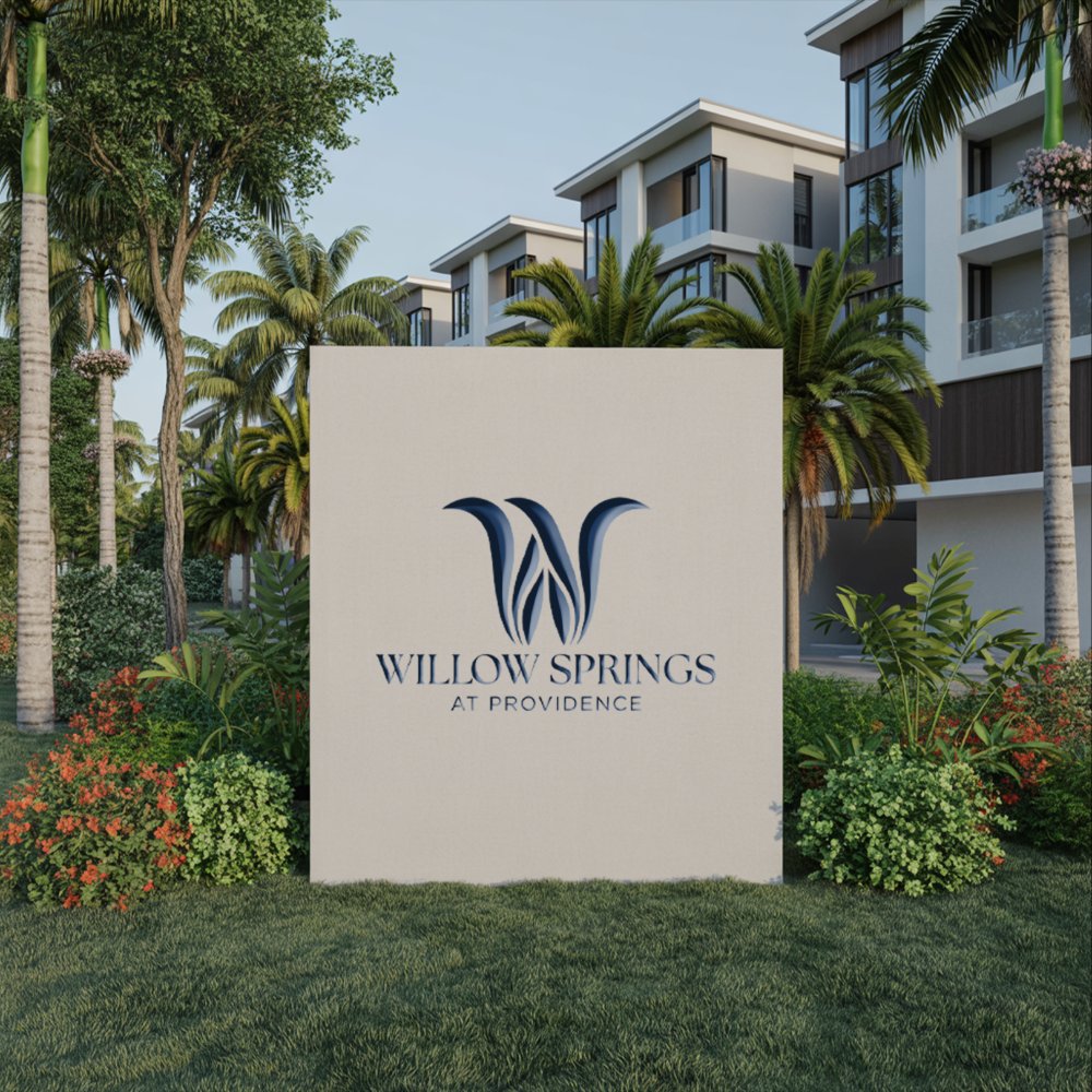
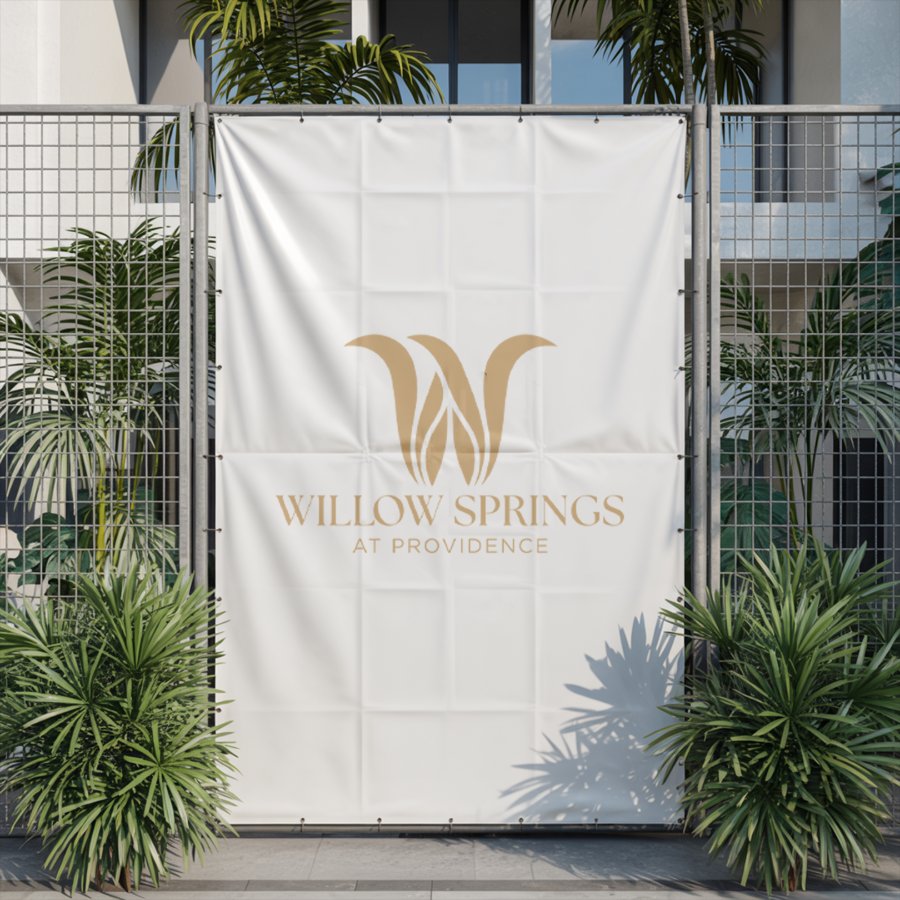
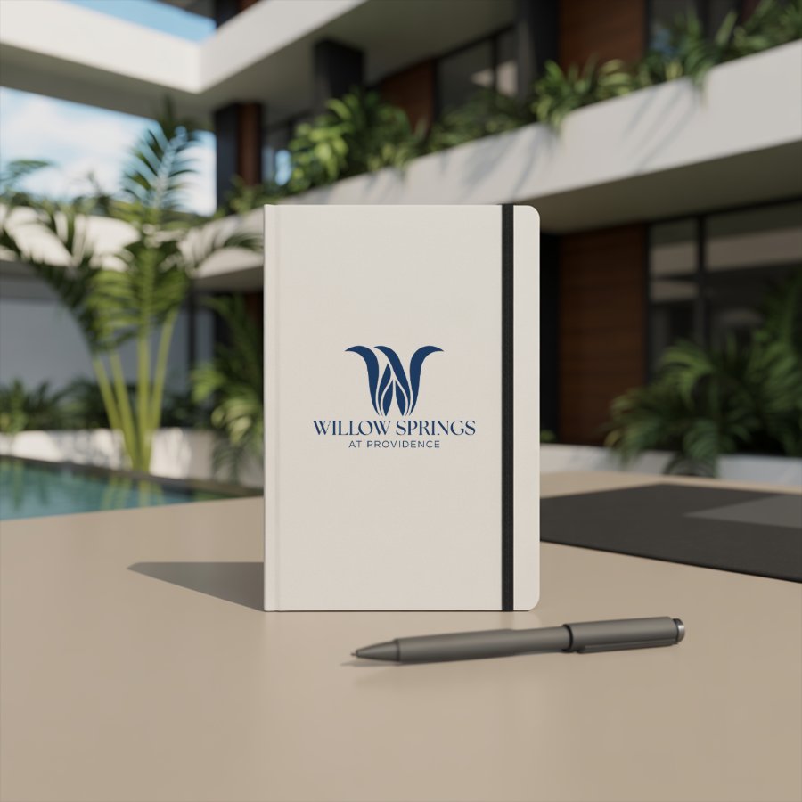
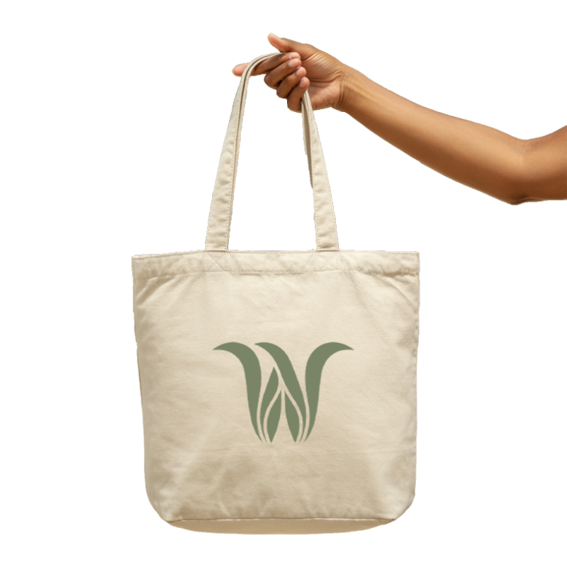
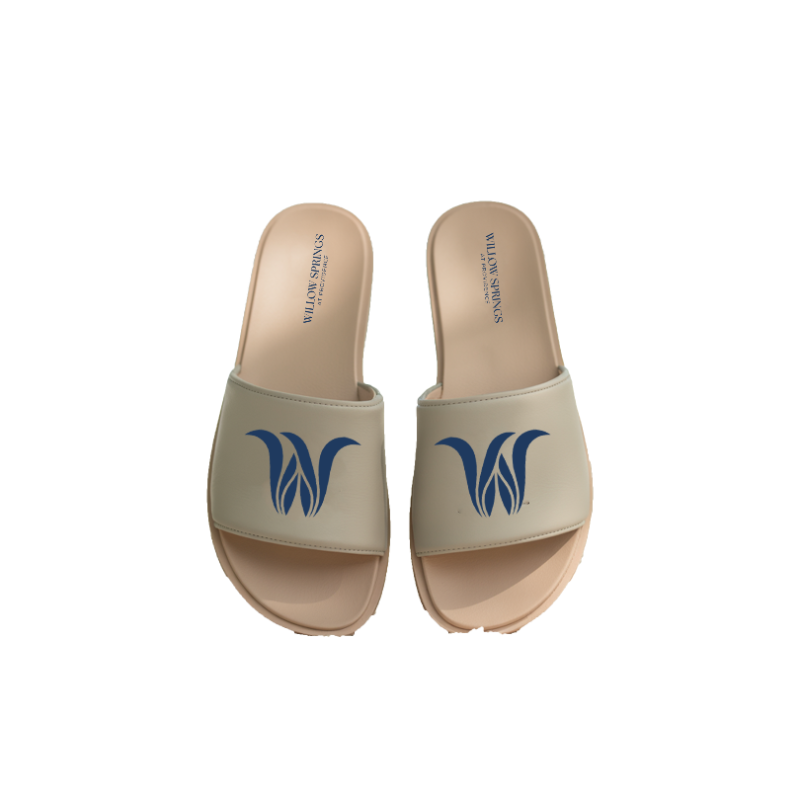
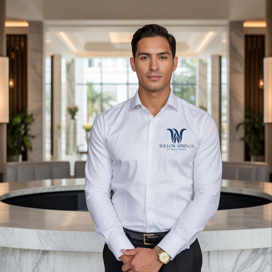
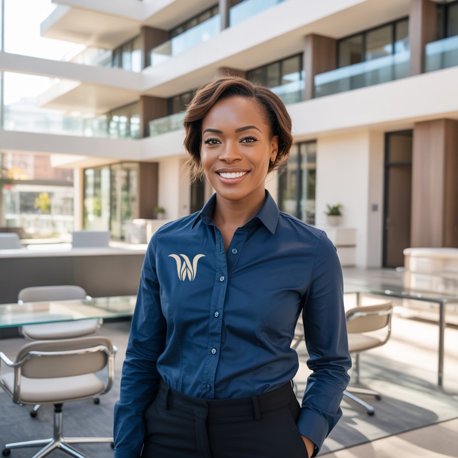
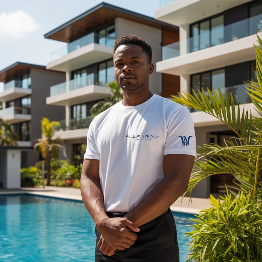
A more fluid, minimal logo, a soft coastal palette chosen for trust and stability, and a pattern, carried onto signage, uniforms, stationery and merchandise.
Chi-ada Corporation
FREELANCE · REBRANDMove a South Florida cleaning company off a red-and-white look that no longer fit, toward a green, modern identity that builds trust from the first impression.
A hummingbird mark and wordmark, a teal and sage palette, a pattern and icon set, applied to staff apparel, totes, stationery and social posts.
Aurora Suites Jamaica
FREELANCE · IDENTITY REFRESHMake a luxury Airbnb in Montego Bay feel as polished and welcoming as the stay itself, with the warmth of the island built in.
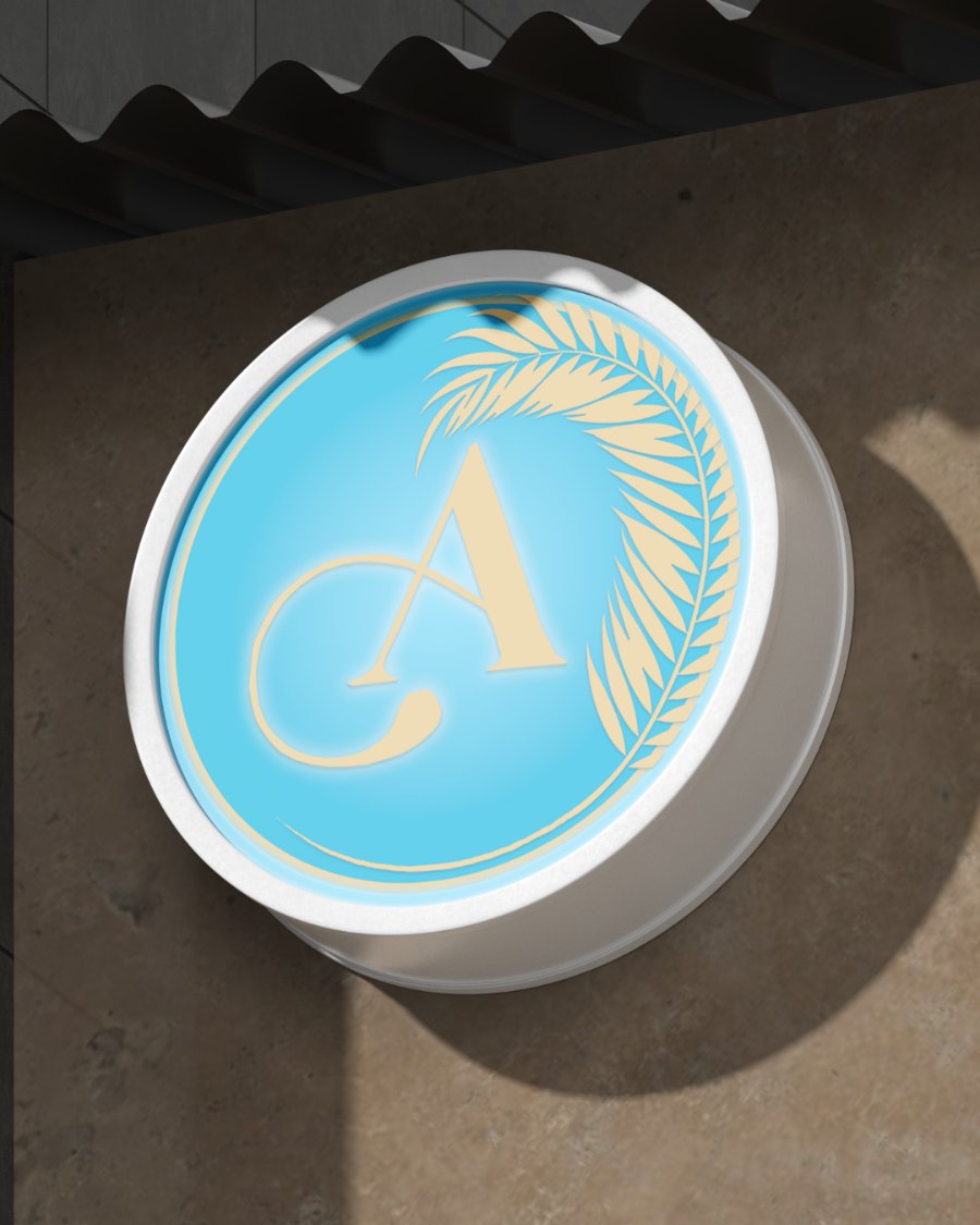
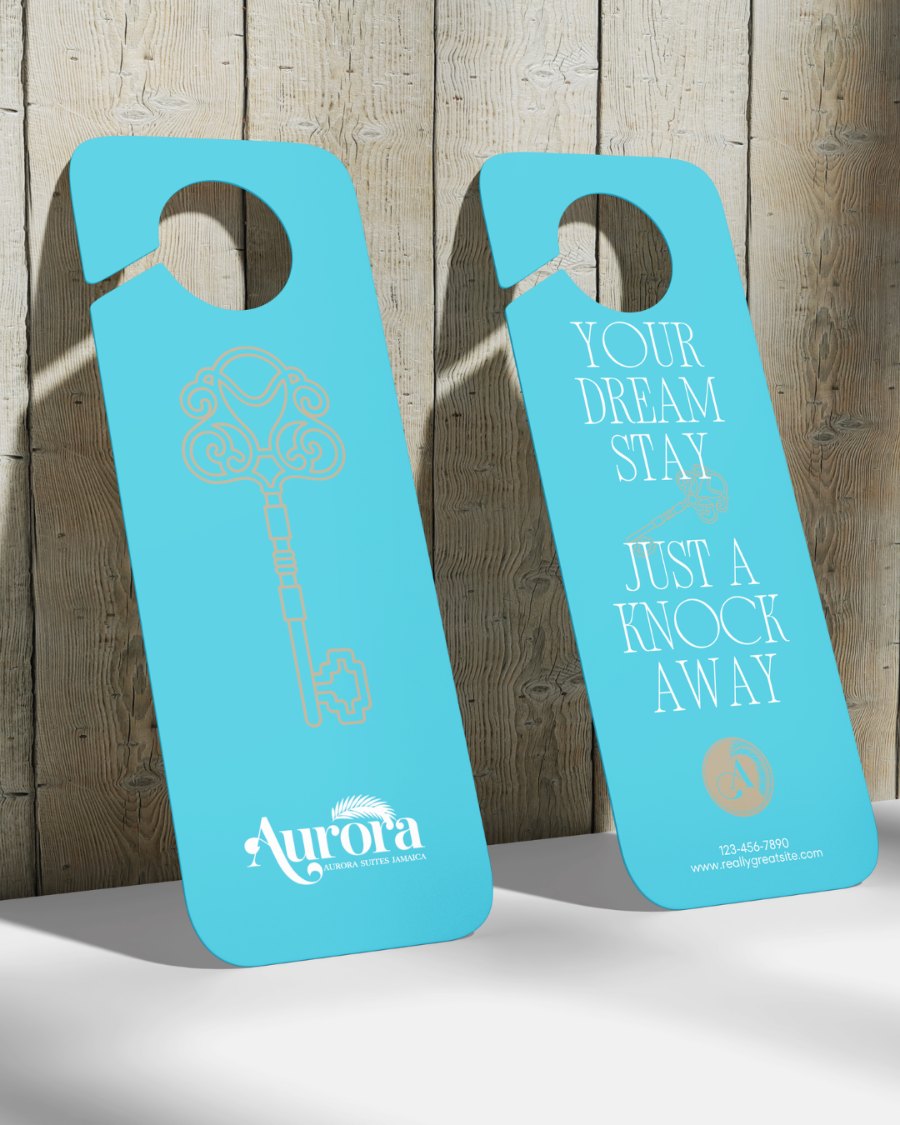
Brighter hues and a streamlined logo system, applied to on-site signage, door hangers and wall graphics.
NNM Productions
FREELANCE · LOGO + EVENT CREATIVEGive a new South Florida comedy producer a look its Comedy Night series could repeat show after show.
The company logo and its first set of flyers for shows at Tootsies Knockers Sports Bar, Miami.
Dueys
PASSION PROJECTBuild a bold, flexible identity for a durag brand that works as well on a sticker as on product packaging.
A wordmark, stacked mark and D monogram in a four-color system of yellow, blue, black and white, applied to a sticker set and packaging concepts for pomade and oil.
JANELLE
SIMON
CREATIVE DESIGNER | DIGITAL MARKETING | BRANDING & CONTENT CREATION786-921-4711
Janhyasimon@gmail.com
LinkedIn ↗
August 2022 – May 2025
June 2015
Creative and execution-driven designer with 5+ years of experience across graphic design, branding, digital marketing, social media, email campaigns, and promotional content. Experienced in developing creative assets for multi-channel campaigns across organic and paid social media, digital platforms, email, and print. Skilled in translating brand strategy into visually compelling content while maintaining consistency, production accuracy, and alignment across formats. Proficient in Adobe Creative Suite, with hands-on experience in photography direction, photo editing and retouching, video content, branding, and campaign development. Comfortable managing multiple projects and shifting priorities in fast-paced environments.
- Lead creative direction and execution of marketing initiatives across Instagram, Facebook, TikTok, and YouTube for a Miami real estate brokerage.
- Create digital campaign assets including social media graphics, listing sheets, flyers, promotional materials, and branded visual content.
- Develop and maintain a consistent visual identity across marketing materials, supporting brand recognition and agent visibility.
- Conceptualize and execute content campaigns designed for different platform formats and audience engagement.
- Produce and refine creative assets while managing multiple deadlines and ongoing marketing priorities.
- Support community and promotional events through on-site content creation and brand representation.
- Designed logos, flyers, and branded assets for hospitality clients across digital and print applications.
- Developed visual materials aligned with client brand standards and project requirements.
- Collaborated with a creative team to deliver campaign and design assets within tight turnaround timelines.
- Developed and executed promotional strategy and creative content for a major Miami event across digital and social media channels.
- Independently created, scheduled, and managed organic and paid social content to build awareness and support ticket sales.
- Designed promotional graphics and campaign materials while maintaining consistent event branding.
- Created and managed audience-facing content and communications across social platforms, adapting creative to platform-specific formats.
- Supported in-person promotional events and community outreach initiatives to extend campaign reach.
- Worked directly with clients to translate brand vision into custom visual identities, marketing assets, and promotional campaigns.
- Created graphics for social media, digital marketing, email newsletters, and promotional initiatives.
- Provided creative direction and visual guidance to support brand consistency across client touchpoints.
- Managed multiple design projects simultaneously while consistently meeting deadlines and revision requirements.
- Supported fashion and event-related content through photo editing, promotional design, templates, and digital assets.
- Created branded graphics and promotional materials supporting social media campaigns, client outreach, and digital marketing.
- Managed social media platforms including content creation, publishing, audience engagement, and ongoing brand consistency.
- Coordinated and directed on-site photo opportunities and created content for community and promotional events.
- Produced platform-specific visual content while balancing multiple projects and recurring deadlines.
- Redesigned the company logo and developed a modern visual identity system.
- Created branded social media content, mockups, and custom icons for digital marketing use.
- Established cohesive visual standards to support consistency across platforms.
- Created event-focused content, promotional flyers, templates, and social media assets.
- Edited photography and developed visual content aligned with the fashion show's brand identity and promotional goals.
SERVICES +
PRICING
Full Picture Beginnings
package at $700Perfect for new business owners ready to launch with confidence. This package is designed to help you build a cohesive brand identity from the ground up. Whether you're starting fresh or refreshing your current visuals, Royal Beginnings gives you all the essentials to stand out professionally online and offline.
- Primary Logo Design
- Business Card Design + 250 cards
- Thank You Card Design + 100 cards
- One E-Flyer Design
- 6 Instagram Content Posts
- Instagram Highlight Icons
- Brand Identity Guide
A Full Picture Revamp
package at $900A powerful rebranding package for businesses ready to elevate and evolve. If you already have a business but your visuals no longer align with your growth—this is your call to upgrade. The Full Picture Revamp Package is built to give you a fresh, elevated brand look and strategy, along with content-ready visuals to relaunch with confidence.
- Primary Logo Redesign
- Submark + Alternate Logo
- Business Card Design + 250 Cards
- Thank You Card Design only
- 9 Instagram Content Posts
- Instagram Highlight Icons
- Brand Identity Guide
- Website Optimization & Redesign
A Full Picture Experience
package at $1300A complete brand + website experience for businesses ready to go big. This is the all-in-one transformation that includes everything in the Full Picture New Beginnings Package plus a professionally designed website that helps you show up and sell online with ease. From visuals to strategy to content—you’ll be fully equipped to breathe easier when it comes to your business.
- Primary Logo Redesign
- Submark + Alternate Logo
- Business Card Design + 250 cards
- Thank You Card Design + 100 cards
- Brochure Design
- 12 Instagram Content Posts
- Instagram Highlight Icons
- Brand Identity Guide
- Full Shopify Website Design
Social Content Master Plan
package at $500For entrepreneurs looking for frequent, professional content designs to elevate their social media presence while they manage the day-to-day posting.
- Full Picture Planner (Monthly Content Calendar Creation)
- Instagram Posts (12 branded social media posts with captions)
- Informational Highlights (4 Instagram Story Designs)
- Social Check-In (30 day performance report & design adjustment recommendations)
À LA CARTE
WELCOME
TO MY
BRAIN.
Marketing Director
LET’S
BUILD
IT.
Tell me what you need, what you’re working with and when you need it. I’ll come back with next steps.
Thank you, {{ form.name }}.
Your email app should open with your request filled in. Hit send there and I’ll get back to you within 2–3 business days. If nothing opened, email me at Janhyasimon@gmail.com.
ALL
PROJECTS
MY BRAIN.
FLYERS
WELCOME TO MY BRAIN.
Whiteline Fleet & Logistics
23 driver leads in 30 days for a brand-new car rental brand
Cold start. Zero history.
The client had a brand-new Facebook page and an ad account with no history and no audience. The goal was to bring in qualified rental leads from local drivers right away.
The route to 23 leads
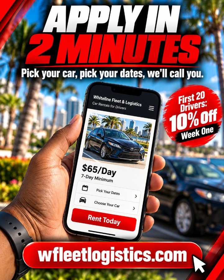
An Instant Form campaign let drivers apply without leaving Facebook or Instagram. A Website Application campaign sent traffic to the site I designed and built, tracked with the Meta Pixel. Each ran on $25/day.
Ads ran within 25 miles of West Palm Beach. I used Advantage+ audience and placements and set the campaigns up correctly under Meta’s Financial Products & Services special ad category.
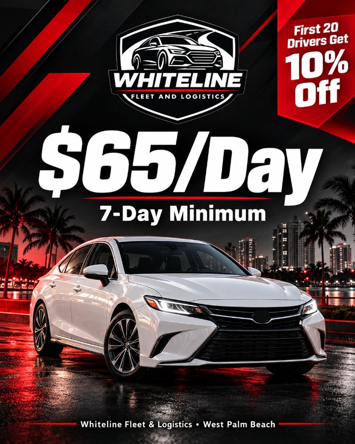
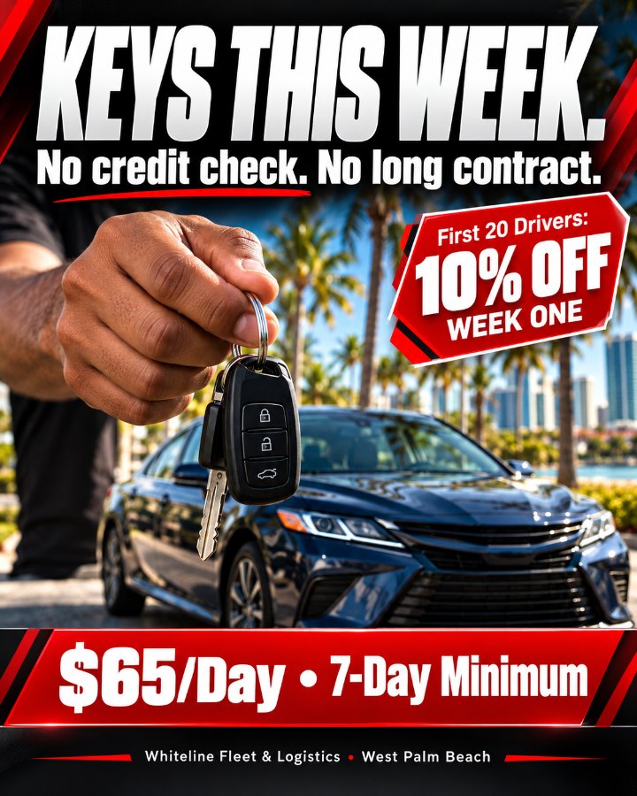
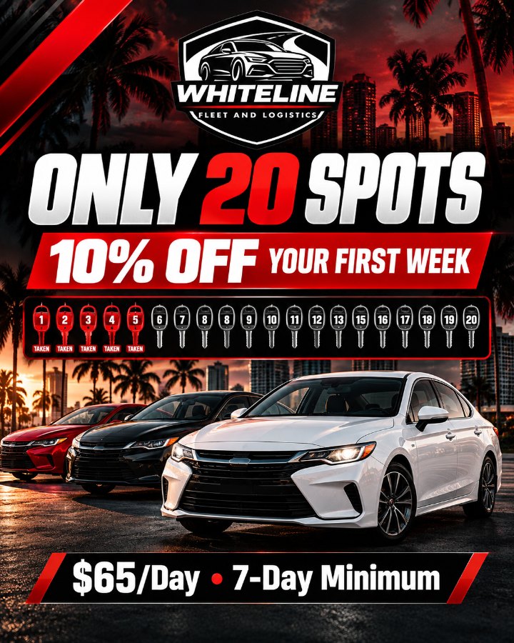
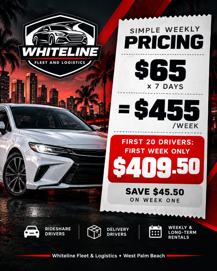
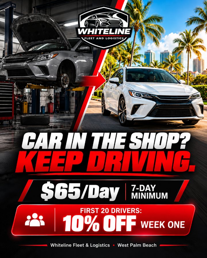
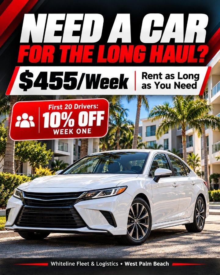
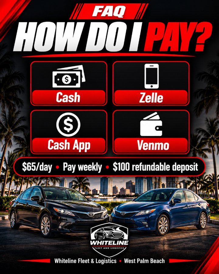
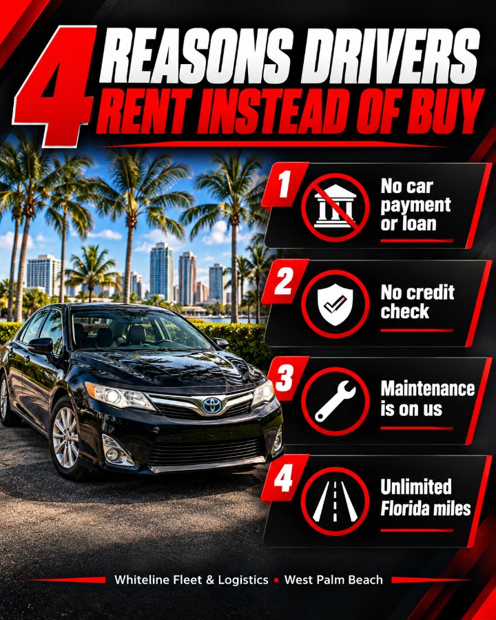
The hook was “Ready to drive, but no car? 🔑”, followed by an easy-to-scan offer: $65/day, unlimited Florida miles, no credit check, maintenance included. Urgency came from “The first 20 drivers get 10% off their first week.”
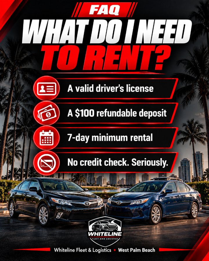
The form asked which apps they drive for, when they need the car, and whether they can cover $455/week plus a $100 refundable deposit. That filtered out leads who weren’t a fit before the client spent time on them.
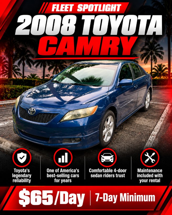
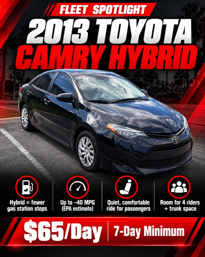
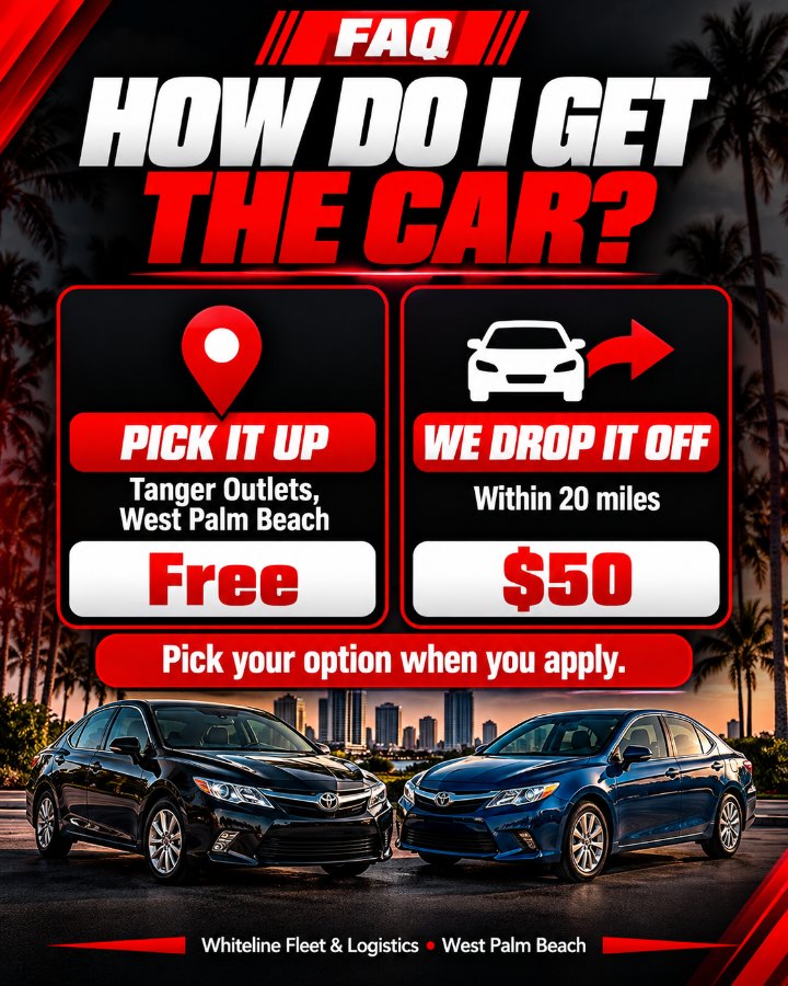
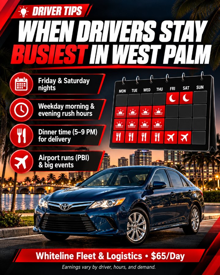
The ad graphics put the $65/day price front and center in the brand’s red, black and white.
“Keys This Week” (problem-first) ran against “Driver Offer” (platform-specific). “Keys This Week” brought in 14 of the 15 form leads at the lowest cost per lead.
Leads were worked in Meta Leads Center through three stages: Intake, Qualified and Converted. 17 of the 21 form leads (about 81%) qualified.
Instant Form vs. website
Rideshare and delivery drivers are on the go. A form that opens inside Facebook or Instagram asked less of them than leaving the app for a website, and it brought in 21 of the 23 leads.
Problem-first beat platform-specific
Ad-level results from launch week, Oct 9–12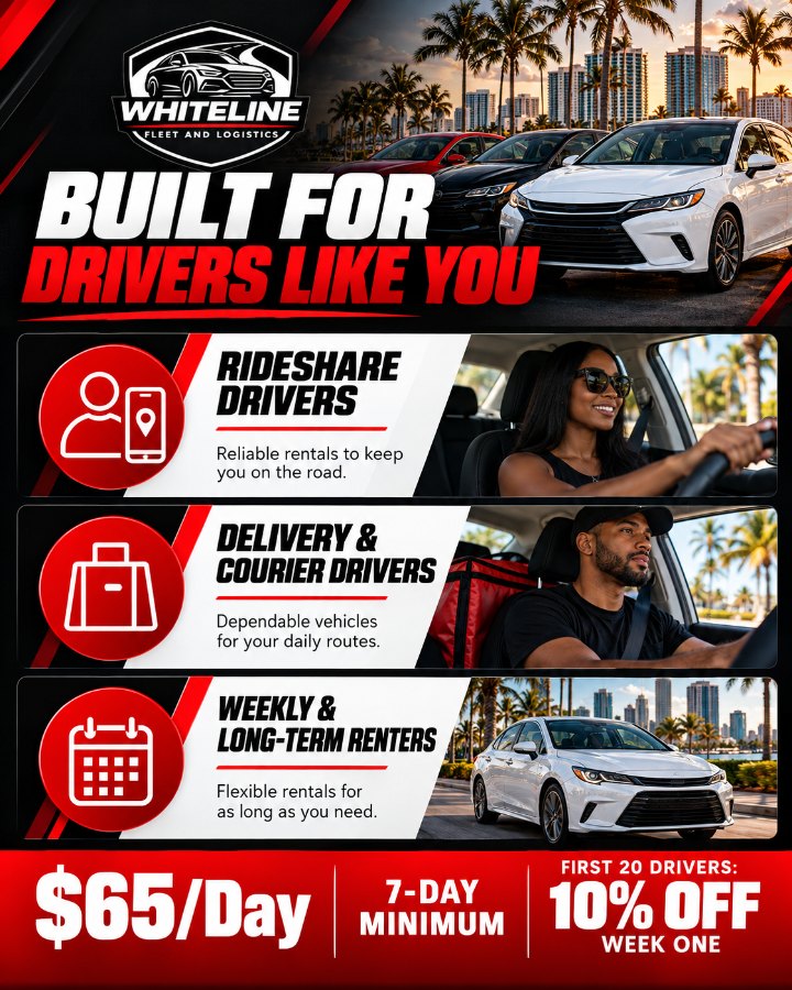
Leading with the driver’s problem, not the product, cut cost per lead to $4.53 on a cold account with no history.
KEY TAKEAWAYFifteen pieces, one look
Every ad and post I made for the launch, grouped by the job it does.
The website
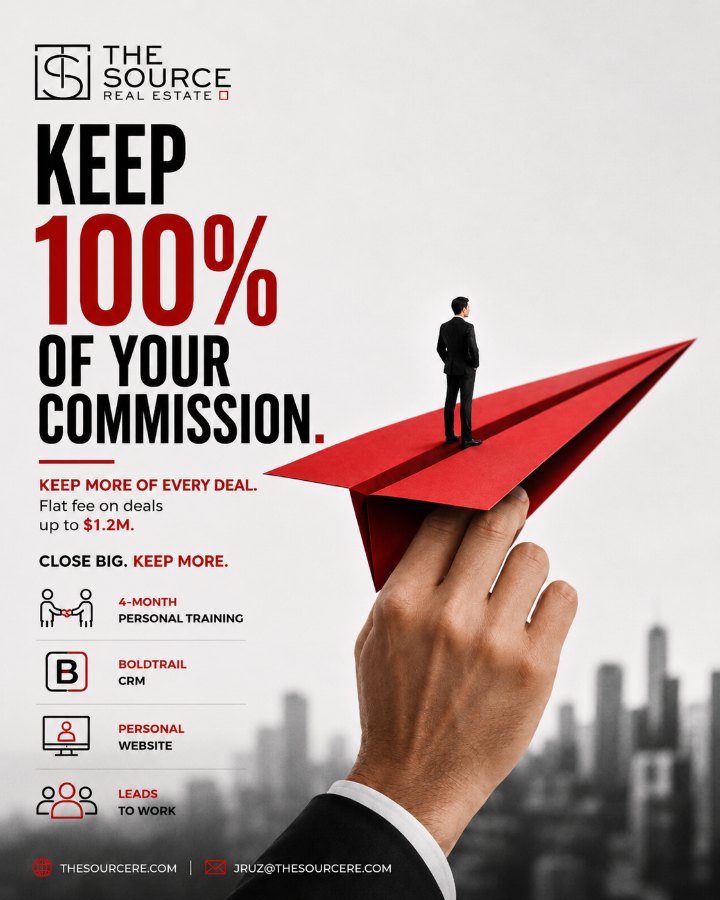
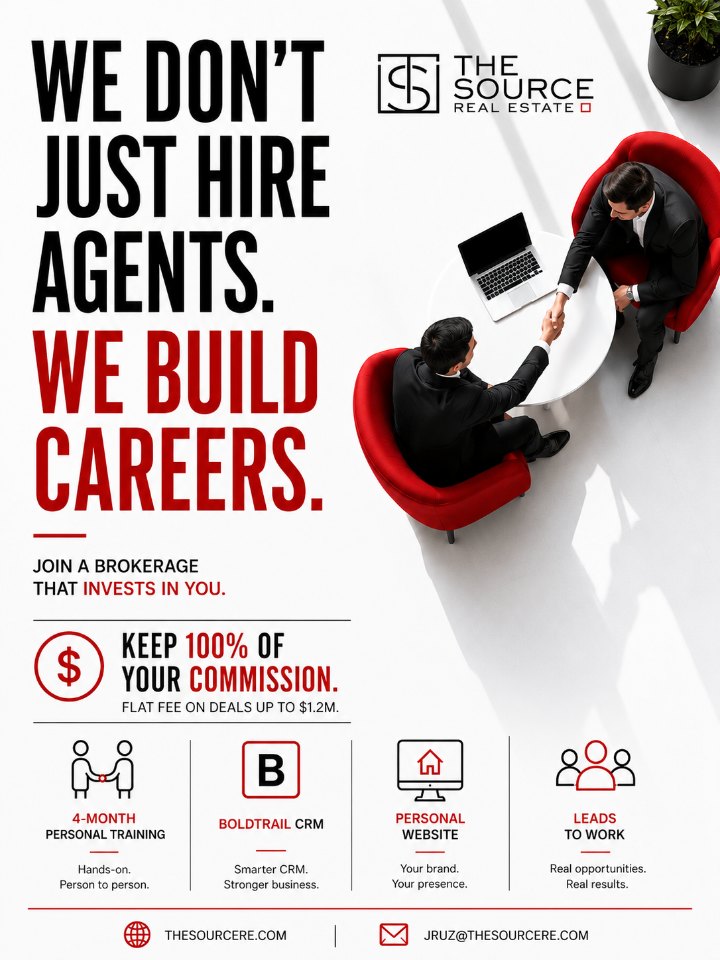
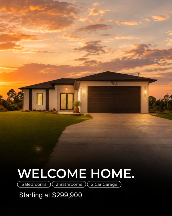
Meta ads for The Source.
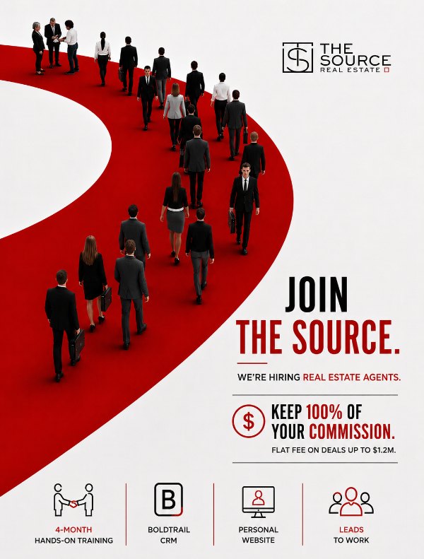
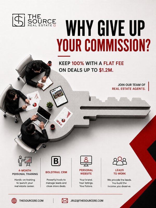
Agent recruiting, page growth and brand awareness across South and Central Florida, in English and Spanish. I planned, designed and ran every campaign on this page.
Every campaign, start to finish
Lifetime results across all nine campaigns in Meta Ads Manager.
Agent Recruiting · South + Central FL
Launched in October 2026 and still running. Narrower targeting, aimed only at licensed agents in our two core regions, turned the most expensive goal on the account into the most efficient one.
Nine campaigns, one funnel
Grouped by what each campaign was built to do.
Designed in-house, in two languages
Every ad, graphic and video below was designed by me for these campaigns.
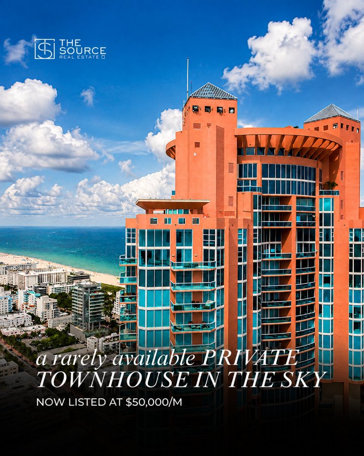
Four things the data made clear
Narrowing the recruiting campaign to agents in South and Central Florida cut cost per lead from $54.38 to $15.11. Same goal, a smaller audience, 72% less per lead.
Boosting posts that looked native to the feed brought Page and profile visits for $0.20 to $0.25 each, with link click-through reaching 14.6%.
Running English and Spanish creative opened the campaigns to South Florida’s Spanish-speaking agents, a market an English-only account would miss.
Awareness and traffic built a warm audience, lead forms captured agents who were ready, and retargeting re-engaged the ones who weren’t yet.